
Designer Onboarding Guide
This guide is your operating playbook as a designer working on a SGEN-hosted site. It covers the four surfaces you own — Globals, SG-Builder, Media, and Templates — and shows you how to load the brand kit once, build layouts that editors can extend without breaking, and hand off a design system that stays coherent from homepage to landing page. Work through the phases in order: Globals before SG-Builder, homepage hero before any secondary layout, reusable templates before handoff.
Globals first, always
Load primary color, secondary color, heading font, and body font into Globals before opening a single page in SG-Builder. Tokens set here cascade site-wide — skip this step and you will spend the rest of the project entering hex values manually into individual components.
Hero is the benchmark
Build and confirm the homepage hero at all six breakpoints before any secondary section. Typography scale, section spacing, and color contrast are calibrated against this first section. Nothing advances until the hero passes a live-page check at desktop and 375px mobile.
Templates, not one-offs
Every finished section becomes a reusable template. Content editors insert the template, fill the text and image fields, and never touch a style setting. That boundary — designer owns the visual container, editor fills it — is what keeps the design system coherent after handoff.
Before your first design session
Confirm these four items with your site owner before opening any SGEN surface. Missing any one of them stalls the project at the worst possible moment — mid-build.
Access
Editor role or higher
Editors can open SG-Builder and save pages. Author-level access and below opens SG-Builder in read-only mode — saves are blocked silently. Confirm your role before the first session, not after a failed save.
Brand Kit
Colors and fonts confirmed
You need: a primary color (hex, RGB, or gradient), a secondary color, a heading font name, and a body font name. If the brand kit is not finalized, push back. Applying an uncommitted palette to SG-Builder means a full-site re-sweep when colors change.
Assets
Logo, hero image, icons ready
Upload all assets to Media before opening the SG-Builder editor on any live page. The asset manifest (logo files in SVG or PNG, hero images, icons) should be complete before Phase 1 begins — not mid-build when the media picker is empty.
Scope
Surfaces agreed with team
Agree on which surfaces are SG-Builder (page-level sections), which are Globals tokens (site-wide color and font), and which need Custom CSS (fine-grained overrides only). Blurring this boundary mid-project is the main cause of design-system drift.
Phase 1 — Load the brand kit into Globals
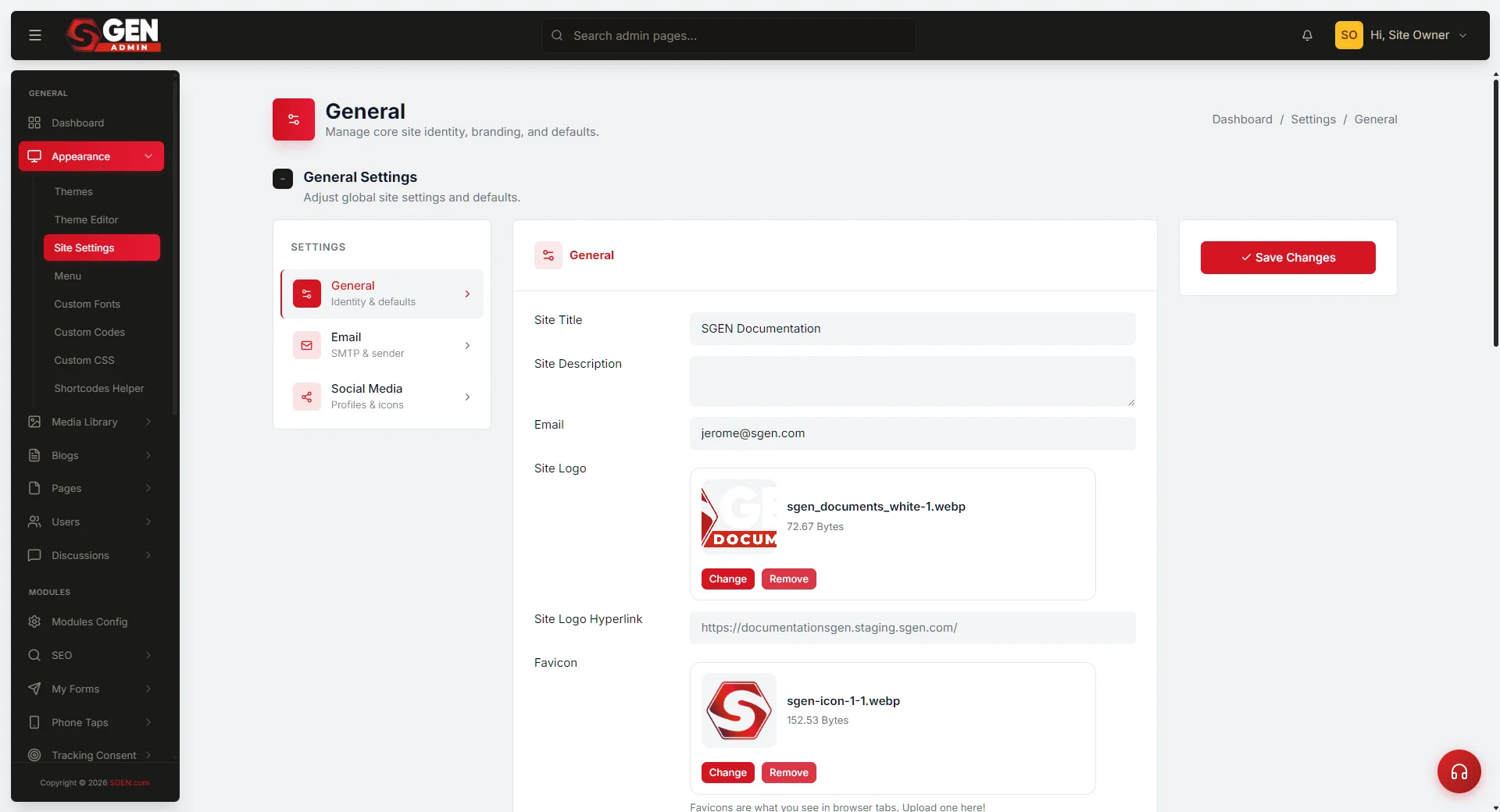
Globals are the site-wide design tokens. Set them once, correctly, and SG-Builder picks them up automatically on every section you build. Go to Settings → Globals in the admin panel and work through these steps in order.
1
Open Globals and set your color tokens
Go to the admin → Settings → Globals. Enter your primary brand color first. SGEN Globals accept hex values (for example #2D5BE3), RGB, and linear-gradient(...) strings for the primary color field — if your brand uses a gradient on the primary action color, set it here directly. Enter the secondary color next. Press Save after each token individually — do not set all fields and save once. Confirm each save so you can catch a silent-fail before it cascades site-wide.
For the Your Store brand, a typical starting token set: primary #2D5BE3 (buttons, links, highlights), secondary #1A1A2E (dark sections, footer), accent #F4A300 (CTAs, badges), neutral #F5F5F7 (section backgrounds, cards).
2
Set the typography tokens
Still in Globals, move to the typography section. Enter your heading font name exactly as it appears in Google Fonts — for example: Inter, Playfair Display, DM Sans. Enter your body font name separately. SGEN loads Google Fonts automatically when the exact name matches the library. For self-hosted or custom-axis fonts, use the Custom Fonts form and assign a unique internal name before referencing it here. Confirm both fonts render in the Globals preview panel before moving to SG-Builder. If a font shows as fallback serif or sans-serif in the preview, the name is wrong — check spelling and case.
3
Upload brand assets to Media before opening the builder
Go to Media. Before you open a single page in SG-Builder, upload all assets you will use: logo files (SVG or PNG), hero images, and any icons. Toggle WebP conversion and compression on before uploading — SGEN defaults to Format: Original and Compression: Off, which produces unoptimized uploads. Organize assets into folders by section (Hero, Features, Testimonials) so SG-Builder's media picker stays navigable once the library grows. SGEN does not rename files on upload — use clean, descriptive filenames before uploading.
Phase 2 — Build the homepage hero in SG-Builder
The homepage hero is the visual benchmark. Everything that follows — typography scale, section spacing, color contrast — is calibrated against this first section. Do not build secondary pages or interior sections until the hero is confirmed at all six breakpoints.
1
Open the page in SG-Builder
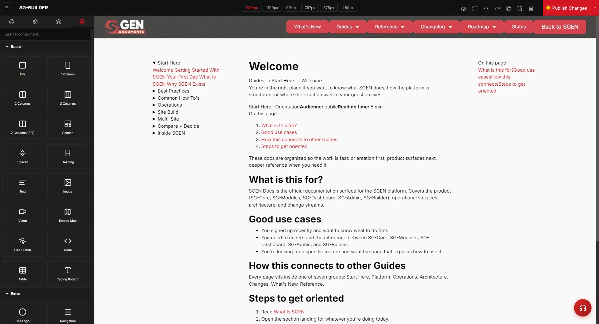
Go to Pages, find the homepage, and click Edit. In the page edit view, click the SG-Builder button to open the visual editor. The editor loads with the current published state of the page. If the page is new and empty, SG-Builder shows a blank canvas — that is the correct starting point.
2
Add the hero section and populate content
In the SG-Builder left panel, open the Components or Blocks library. Drag the hero block type onto the canvas. With the hero selected, use the right panel to set: background image (pick from Media — your uploaded hero image; set overlay color using the Globals primary or secondary token), heading text (the H1 content for this page), subheading text (one sentence, no filler), and CTA button label and destination URL. Note: SGEN text components render as <div> elements, not <p> tags. If you need to target text styling precisely in Custom CSS, use a class assigned via the component's Attributes panel.
3
Set per-breakpoint styles
Before publishing, sweep every breakpoint. Click the breakpoint buttons in the SG-Builder toolbar in this order: 1920 → 1199 → 991 → 767 → 575 → 480. At each breakpoint, adjust font size (heading and subheading), section padding (top and bottom), and column layout (single column at 767px and below is the standard starting point). SG-Builder requires explicit per-device values — if a mobile breakpoint has no values set, it falls through to desktop values, which will almost always break the layout on a phone.
4
Publish and verify on the live page
Once the breakpoint sweep is complete, click Publish in SG-Builder. After publishing, open the live page in a browser tab and confirm: brand colors applied correctly (not fallback browser defaults), heading font rendering as expected (not a system serif fallback), and mobile layout at 375px width — resize the browser window or use responsive-design mode. Do not advance to the next section until the hero passes this check.
Phase 3 — Build reusable section templates
Once the homepage hero is confirmed, build the remaining sections — features, testimonials, call-to-action — and save each as a reusable template. Content editors can insert a template into any page and replace the text and images without touching the visual layer.
1
Build the section with all breakpoints set
Build the section on the page where it belongs — homepage for features, a landing-page template for a campaign section. Follow the same per-breakpoint sweep workflow from Phase 2 — confirm all six breakpoints before saving as a template. A section with unset mobile styles will produce broken layouts for every editor who inserts the template.
2
Save as template with a descriptive name
With the section selected in SG-Builder, right-click or use the component context menu and choose Save as Template. Give the template a clear, descriptive name: for example Your Store — 3-column Features Grid, Your Store — Full-width Testimonial, Your Store — CTA Banner Dark. Do not use generic names like Section 1 or Block A — content editors need to identify the right template from a list without opening each one.
3
Test the template on a second page
Create a test page (or use an existing draft page that is not live). Open it in SG-Builder, go to Templates, and insert the saved template. Confirm: the section renders with brand colors and fonts from Globals; the layout matches the original at desktop and mobile; text and image fields are editable without triggering a style change. If the template renders with an unexpected layout or color, the component has inline overrides not reading from Globals — reset those overrides to the Globals token, re-save the template, and test again.
Design-system handoff checklist
The handoff is a gate, not a ceremony. Before declaring a design handoff complete, confirm all seven checks below. When all are green, the design system is ready for content editors.
Globals color tokens set and saving
At least primary and secondary tokens saved; confirmed applying in SG-Builder sections — not overriding inline values.
Globals typography set
Heading and body fonts confirmed rendering in the Globals preview panel and on the live page — not system fallback fonts.
Homepage hero at all 6 breakpoints
No mobile collapse, no font fallback, colors reading from Globals tokens not inline overrides. Published and verified on the live page.
At least 2 reusable templates saved
Each template tested on a second page by inserting from the Templates panel. Style bindings confirmed; content fields editable.
Content editors briefed on editable scope
Text and image fields only — no style settings. Brief verbally in addition to sharing this guide.
Custom CSS scoped to page_id selectors
All Custom CSS overrides use body.page_id-<n> selectors — no bare class overrides that bleed to other pages.
Media library organized
Assets in named folders; WebP + compression confirmed on all uploads. No unoptimized originals in the media picker.
Your access scope
Visual design in SGEN runs through four surfaces. Everything else belongs to another role — route requests accordingly rather than expanding access.
Yours
Design surfaces you own
Settings → Globals (brand tokens) · Pages → Edit → SG-Builder (page sections and layouts) · Pages → Edit → SG-Builder → Templates (save and insert reusable sections) · Media (upload and organize assets) · Settings → Custom CSS (polish-layer overrides only).
Not Yours
Areas to route to other roles
Analytics and Forms (Marketing Manager) · Blog and page copy (Content Editor) · Custom Codes — HTML/JS injection (Developer) · User management (Platform Admin) · Ecommerce orders and products (Ecommerce Manager).
Common issues and fixes
Four problems come up repeatedly on first design sessions. Each has a deterministic fix.
Brand color not applying site-wide after saving Globals
Open Settings → Globals and confirm you pressed Save after entering the hex value — the field accepts input without a forced save, so it is possible to navigate away before the write commits. If the color is saved but not applying, open a page in SG-Builder and confirm its color properties are reading from the Globals token rather than an overriding inline value. Inline values set at the component level override Globals — reset those components to the Globals default.
SG-Builder save returns "saved" but the change does not appear
SGEN returns saved even when a save is silently rejected. After any save, reload the page in SG-Builder and verify the change persists. If it does not, the most common cause is a stale localStorage entry from a previous session. Open your browser's developer storage panel, clear localStorage for the site domain, reload the editor, and re-apply the change.
Mobile layout collapses at 767px or below
Go to the affected page in SG-Builder and click the 767 breakpoint button in the editor toolbar. Inspect the section at that breakpoint — if padding, font-size, or column-count settings are missing, those per-device properties were never set. Apply the correct values at 767px and re-publish. Do not patch this in Custom CSS — an override at mobile is invisible in SG-Builder's device view and creates maintenance debt.
Fonts not loading on the live site
If you loaded a Google Font by name in Globals, confirm the name matches exactly the Google Fonts library name (case-sensitive). If you uploaded a self-hosted font, confirm the upload used a unique font name in the Custom Fonts form — SGEN does not deduplicate font names. If the font loads in SG-Builder preview but not on the public page, the font may be referenced in a component style saved before the Globals font token was set — re-save the affected sections.
Heads up Custom CSS in SGEN is a polish layer, not a design system. Build in Globals and SG-Builder first. Custom CSS is only for overrides that Globals and SG-Builder cannot reach — and every rule must be scoped to
body.page_id-<n> so it does not bleed to other pages.