
SG-Builder
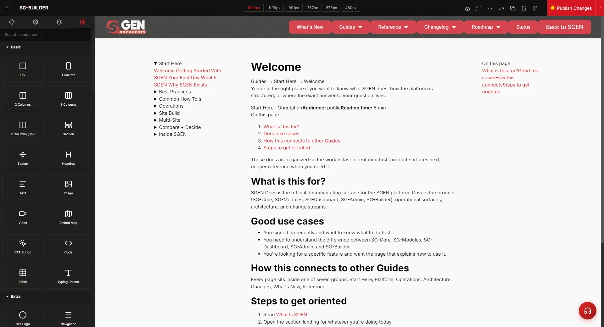
⏱ ~2 min read · landing page — each surface links to its own full reference.
In short. SG-Builder is the drag-and-drop visual editor where you compose, adjust, and publish SGEN pages. You work on a canvas, switch between six responsive breakpoints, pull components from the Component Library, and publish explicitly when you're ready. It writes into SG-Core's page records; SG-Admin is the door in. Everything you build here stays clean and structured — not a pile of inline overrides.
On this page: What this is for · Use cases · How it connects · Surfaces · Design rationale
What is this for?
SG-Builder owns visual page composition. Pages, sections, components, reusable patterns, layout decisions, responsive breakpoints — all happen here. It's the editing canvas SGEN ships natively, designed to give the fluid drag-and-drop experience of a modern builder while preserving clean structured output that doesn't fall apart at month six.
You open SG-Builder when the work is visual: building a new page, composing a hero section, reusing a template, adjusting breakpoints, saving a section as a pattern.
Good use cases
- Building a new page from a design brief.
- Updating an existing layout — moving sections, swapping content, adjusting spacing.
- Saving a reusable pattern — sections you repeat across pages.
- Adjusting responsive behavior across the six breakpoints (1920, 1199, 991, 767, 575, 480).
- Applying a template to a new page so it inherits global structure.
- Previewing a change before publishing it live.
When NOT to use this
| Task | Go here instead |
|---|---|
| Manage users, roles, settings, content metadata | SG-Admin |
| Multi-site portfolio operations | SG-Dashboard |
| Underlying page persistence, deploy, or rendering | SG-Core |
| Write post copy, manage taxonomies | SG-Admin or SG-Core |
How this connects to other features
SG-Builder writes into SG-Core's page records when you save a layout. The platform connections:
- SG-Core owns the page object. SG-Builder edits the page's content and structure inside that record.
- SG-Admin is where SG-Builder is launched — open a page → click Edit → land in SG-Builder.
- Templates (an SG-Core object) are inherited into pages via SG-Builder. Update a template and pages using it update too.
- Site Settings (typography, global colors, button styles, layout rules) are global design rules SG-Builder respects.
- Component Library is the catalog of reusable blocks SG-Builder draws from.
If a published page doesn't render correctly, check SG-Builder (composition) → Site Settings (design rules) → the template (inheritance), in that order.
Where to go
SG-Builder organizes composition around these surfaces.
Builder Workspace
The main editing canvas. Page structure on the left (Layer Manager). Component library on the right. Top bar for editor actions, breakpoint switcher, publish button.
Full detail: Builder Workspace
Component Library
Inventory of blocks: Basic Blocks (layout primitives), Extra Blocks (UI components), Posts Blocks (post-aware), Ecommerce Blocks (store-aware). Drag from here onto the canvas.
Full detail: Component Catalog
Layer Manager
Hierarchical view of editable page structure. Sections → containers → rows → columns → individual components. Used to navigate dense layouts and understand composition order.
Full detail: Layer Manager
Page Settings
Page-level metadata, slug, SEO overrides, template inheritance, custom CSS scope.
Site Settings
Global design system: Global Colors, Typography, Buttons, Header, Footer, Layout, Navigation. Changes here affect every page that inherits the global rules.
Templates Library
Reusable layouts and starting points. Apply a template to a new page or save the current page as a template.
Full detail: Templates
Responsive Preview
Breakpoint switcher. Breakpoints: 1920px, 1199px, 991px, 767px, 575px, 480px. Click each to preview and adjust per-device styles.
Full detail: Responsive Preview
Publish Changes
The commit surface for builder edits. Separates page composition from public release. Publish is explicit, not implicit.
For the full step-by-step build workflow: SG-Builder Overview
Architectural framing
SG-Builder exists because the visual editing experience and the production-grade output are usually at odds in legacy platforms. Builders that look great produce code that doesn't survive maintenance. Builders that produce clean code are slow to use. The team ends up choosing — and either side of that choice produces costs the other team sees.
SGEN's builder gives the fluid drag-and-drop experience designers expect, with clean semantic output that doesn't need apologizing for. Server-side rendered. Scoped components. Reusable patterns. Predictable responsive behavior across the six standard breakpoints. The right path is easier than the chaotic path.
Related reading
- SG-Builder Overview — step-by-step build workflow, success criteria, troubleshooting.
- Builder Workspace — canvas, layer manager, editor actions in depth.
- Component Catalog — the block catalog SG-Builder draws from.
- SG-Core → Pages and Posts — the page object SG-Builder edits.
- SG-Core → Templates — how template inheritance works.
- SG-Admin — where SG-Builder is launched from.