
Builder Workspace
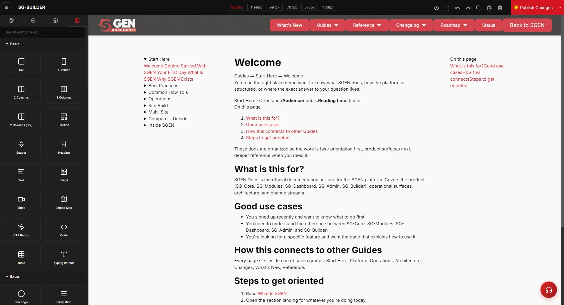
⏱ ~5 min read · the three regions of the editor, the five tabs in the side panel, the breakpoint strip, and how to publish — plus the things that trip people up.
In short. The builder workspace is the screen you see whenever you edit a page or post in SG-Builder. It has three regions that work together: the canvas in the centre, where your page renders and where you drag blocks in and rearrange them; the side panel, a single tabbed surface that switches between the block library, the selected block's settings, the Layer Manager, the Style Manager, and page settings; and the top bar, which holds the breakpoint strip for previewing each screen size and the Publish Changes button. Selecting a block on the canvas opens its settings in the side panel; clicking a breakpoint resizes the canvas; clicking Publish makes your edits live.
On this page: The three regions · The side panel tabs · The breakpoint strip · Saving and publishing · A typical editing pass · Troubleshooting · Vocabulary
The builder workspace is the editor shell that hosts every SG-Builder session — it opens when you choose Edit with SG-Builder on a page or post and stays in front of you the whole time you're composing. Getting comfortable with its three regions is most of what it takes to work quickly.
The three regions
| Region | Where | What it does |
|---|---|---|
| Canvas | Centre | Renders the page as you build it. Click an element to select it; drag a block from the library to add it; drag an element already on the page to move it. What you see here is a close preview of the published result. |
| Side panel | One side, beside the canvas | A single tabbed surface. The tabs switch it between the block library and four inspectors. Selecting a block on the canvas brings its settings forward automatically. |
| Top bar | Across the top | Holds the breakpoint strip (for previewing each screen size), the menu for leaving the editor and reaching page/site settings, and the Publish Changes button. |
A common first impression is that the block library is a separate left-hand panel and the block settings are a separate right-hand panel. They are the same side panel showing different tabs — opening the blocks tab swaps the panel to the library, and selecting a block swaps it to that block's settings. There's one panel, several tabs, not two facing panels.
The side panel tabs
The side panel has five tabs. You move between them with the tab buttons, and selecting a block on the canvas opens the right one for you.
| Tab | What it shows |
|---|---|
| Blocks | The full library of components you can drag onto the canvas, grouped by category (Basic, Extra, Posts, Ecommerce). This is your starting point for adding anything new — see Components. |
| Settings (block) | The selected block's editable properties — its content, spacing, alignment, colours, and link or behaviour options. This is where you configure whatever you've clicked on the canvas. |
| Layer Manager | A tree view of the whole page's structure — every section, row, column, and block, nested as they sit on the page. Click a node to select it on the canvas. It's the easiest way to grab a buried element. Full detail: Layer Manager. |
| Style Manager | Finer style control for the selected block — typography, colour, spacing, borders — layered on top of your site's theme. |
| Settings (page) | Page-level settings such as the page title and metadata, which apply to the whole page rather than a single block. |
The breakpoint strip
Across the top bar is a row of screen-width buttons: 1920, 1199, 991, 767, 575, and 480. Each one resizes the canvas to that width so you can see how the page reflows from a wide desktop down to a small phone. The widest is selected by default.
Use the strip the way a visitor's browser would: build at the desktop width, then click down through the smaller sizes to check that your sections stack, your text stays readable, and nothing overflows. Most blocks reflow sensibly on their own, but the breakpoint strip is how you confirm it and how you scope any per-device tweaks. For the full walkthrough, see Responsive Preview.
Saving and publishing
The top bar holds a single Publish Changes button — that's the action that makes your edits live. SG-Builder doesn't show a separate "Saved" label in the bar; instead, the Publish button itself reflects whether the page has unpublished edits (a draft state) versus being fully published.
The practical takeaway: your edits aren't live until you click Publish Changes, and you should give the publish a moment to complete before navigating away from the editor. Leaving the editor mid-publish can drop the in-progress save. After publishing, open the page in a normal browser tab to confirm the live result. For the full publish flow, see Publish Changes.
A typical editing pass
- Open the page and choose Edit with SG-Builder to land in the workspace.
- Open the Blocks tab and drag in what you need — start with a Columns block for structure, then drop content blocks into the columns.
- Click an element on the canvas; its Settings open in the side panel. Edit its text, link, and look.
- Use the Layer Manager to reorder sections or to reach an element that's hard to click on the canvas.
- Step through the breakpoint strip to check the page at each screen size.
- Click Publish Changes, wait for it to finish, then verify on the live page.
Troubleshooting
- I can't find the block library. Open the Blocks tab in the side panel. The library and a block's settings share that one panel — selecting a block hides the library until you switch back to the Blocks tab.
- There's no "Saved" message — did my work save? SG-Builder doesn't show a standalone save label. Your edits go live when you click Publish Changes; the button itself reflects whether there are unpublished edits.
- My changes aren't on the live site. Make sure you clicked Publish Changes and let it finish before leaving the editor, then reload the live page (a hard refresh helps if you just published).
- The page looks fine on desktop but cramped on phone. Step through the breakpoint strip down to 575 and 480 and adjust the affected sections at those sizes — see Responsive Preview.
- I can't select the element I want on the canvas. It's probably nested under another block. Open the Layer Manager and click it in the tree instead.
Vocabulary
- Workspace — the SG-Builder editor screen, made up of the canvas, the side panel, and the top bar.
- Canvas — the centre region where your page renders and where you drag and arrange blocks.
- Side panel — the single tabbed surface beside the canvas (Blocks, block Settings, Layer Manager, Style Manager, page Settings).
- Breakpoint strip — the row of screen-width buttons that resize the canvas for each device.
- Publish Changes — the top-bar button that makes your edits live.
Related reading
- SG-Builder Overview — the parent surface.
- Components — the blocks you drag from the library.
- Layer Manager — the side panel's tree view.
- Responsive Preview — the breakpoint strip in detail.
- Publish Changes — the publish flow in detail.