
Components
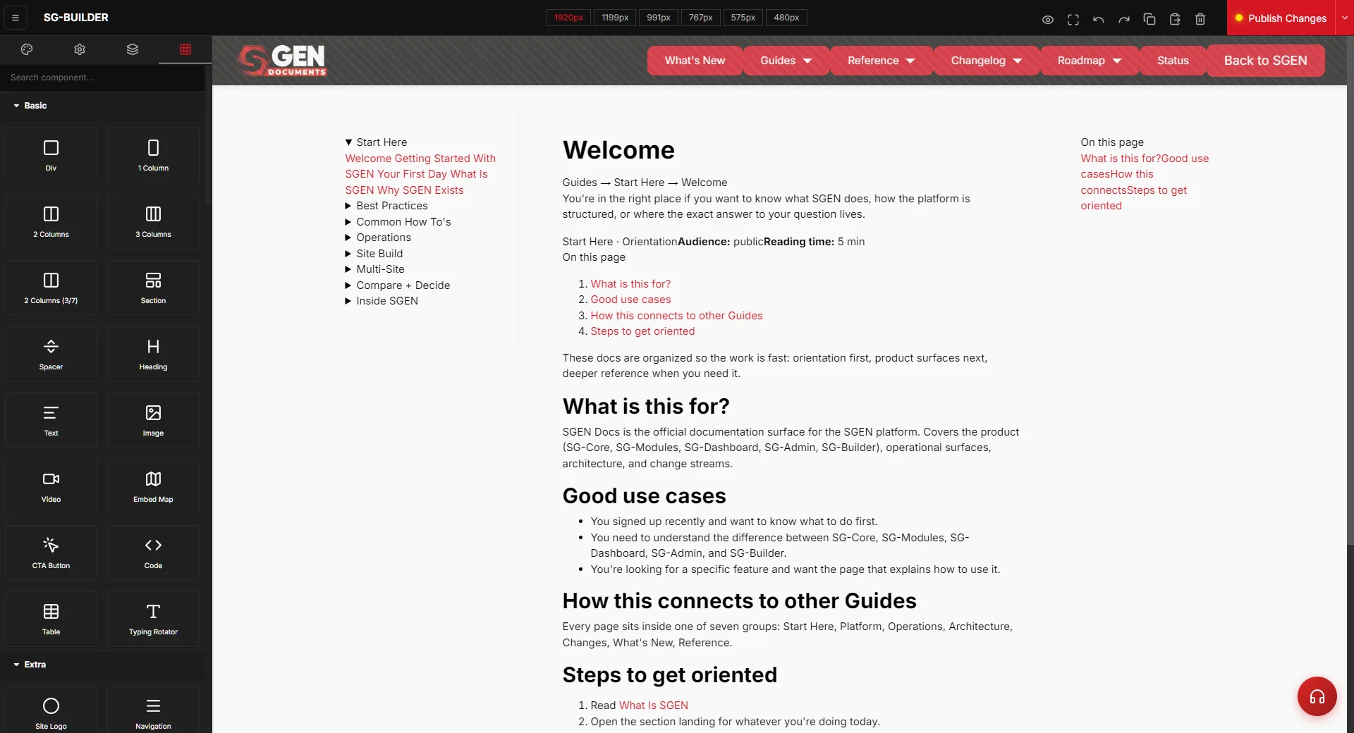 Container>Row>Column>block nesting." loading="lazy" style="width:100%;max-width:900px;height:auto;border-radius:8px;border:1px solid #e5e7eb;display:block;margin:12px 0">
⏱ ~5 min read · what a component is, the four categories, the traits that configure each one, how they nest, and how to pick the right block the first time.
In short. Components are the drag-and-drop building blocks you compose a page from in SG-Builder — a heading, a button, an image, a pricing table, a product grid. They are first-party: SGEN ships and maintains them, so there's no plugin marketplace to install, vet, or keep updated. They fall into four groups — Basic, Extra, Posts, and Ecommerce — and every one is configured the same way, through traits (its editable properties) in the side panel. Components nest in a fixed order — section, then container, then row, then column, then the content blocks inside — and the Layer Manager shows you that structure as a tree.
On this page: What a component is · The four categories · Configuring with traits · How components nest · Picking the right component · Worked examples · Troubleshooting · Vocabulary
What a component is
Components are the reusable visual units you drag onto the canvas and then configure. "Block" is the same thing — you'll hear both words, and the builder's library panel calls them blocks.
The thing that makes SG-Builder components different from a generic page builder is that they're first-party. Every block is part of the platform, not a third-party add-on you install from a marketplace. That has two practical upshots: you never hunt for, evaluate, or pay for a plugin to get a feature, and you never inherit a plugin's security or compatibility problems. The trade-off is that the block set is fixed to what SGEN ships — when a new component lands, it arrives with a platform release rather than from an external author.
Every block also comes pre-wired with the things a hand-built element would miss: responsive behaviour across breakpoints, per-device show/hide, and full undo/redo. That's why the rule of thumb is reach for a component before reaching for raw code — there's almost always a block that already does what you need.
Where to find them
Open any page or post in SG-Builder, then open the Blocks library from the workspace side panel. The library is grouped into the four categories below. Drag any block onto the canvas to drop it in, and the side panel switches to that block's traits so you can configure it right away. (For the full tour of the library panel, see Finding components.)
The four categories
SG-Builder ships a set of first-party components split across four categories. Basic holds the layout and content essentials. Extra holds the higher-level, specialty blocks — cards, accordions, sliders, testimonials and the like. Posts holds blocks that surface your blog and other post-type content. Ecommerce holds the store blocks, and those need the ecommerce module enabled on the site before they'll render.
| Category | What it covers | A few of the blocks |
|---|---|---|
| Basic | Layout shells and the everyday content elements | Section, Columns (1/2/3 and 3-7), Heading, Text, Image, Button, Video, Map, Code |
| Extra | Higher-level, pre-styled patterns | Cards, Pricing Cards, Accordion, Tabs, Testimonials, Gallery, Slider, Icons, Icon Text Lists, Form, Navigation, Site Logo |
| Posts | Blog and post-type content | Post Title, Post Content, Featured Image, Post Navigation, Posts Archive, Related Items |
| Ecommerce | Online store (requires the ecommerce module) | Products grid, Product Card, Product Title/Price/Description/Gallery, Add to Cart, Cart Button, Mini Cart |
The Posts and Ecommerce blocks pull from live data, so they show their real content on the published page rather than in the editor canvas. A Post block placed on a page that isn't a post template, or a product block before you've connected a product, will look empty while you build — that's expected, not a fault.
Configuring with traits
You don't edit a component by typing into raw markup — you edit its traits. A trait is one editable property, and selecting a block on the canvas opens its traits in the side panel. The traits you'll touch fall into a few groups:
| Trait group | What you control | Examples |
|---|---|---|
| Content | The words, images, and links the block shows | A heading's text, a button's label and link, an image's source |
| Layout & spacing | How the block sits in its space | Padding, margin, alignment, column width |
| Decoration | The look | Background colour, border, shadow |
| Behaviour | What the block does | Where a button points, whether a block is hidden on a given device |
| Per-device overrides | Values that change by screen size | A smaller heading on phones than on desktop |
A worked example: drop a button (the CTA Button block) and you'll set its text (the visible label), its link (where it points and whether it opens in a new tab), and its style (one of the built-in button styles — primary, secondary, and so on, with an optional outlined variant). Each lives in its own trait — there's no need to touch any code to change any of them.
One thing worth knowing: the name a block shows in the Layer Manager tree (its identity — "Heading", "CTA Button") is separate from the text it displays on the page. You set the visible copy in the content trait; the tree label stays as the block type so the structure reads cleanly.
How components nest
Pages in SG-Builder are built from a consistent nesting order. From the outside in:
Section → Container → Row → Column → content block.
- A Section is the full-width band that runs edge to edge — it's where a full-bleed background colour or image belongs.
- A Container sits inside the section and clamps the content to a comfortable maximum width so it doesn't stretch across a wide monitor.
- A Row holds one or more columns side by side and manages the gap between them.
- A Column is one cell of the row; it controls its own width and how it stacks on smaller screens.
- The content blocks — headings, text, images, buttons, cards — live inside the columns.
You rarely build this by hand cell by cell: dropping a Columns block (1, 2, 3, or a 3-7 split) lays down the row and its columns in one move, already set to stack on tablet and phone. The Layer Manager shows this nesting as an indented tree, which is the easiest way to confirm a block landed where you meant it to and to grab a buried element. Keeping to the nesting order is what gives you content that breathes away from the screen edge and collapses correctly on mobile.
Picking the right component
The most common mistake is dropping a generic box and trying to make it behave like a purpose-built block. There's nearly always a dedicated component — and using it means you inherit its responsive behaviour and styling for free. Use this as a quick guide:
| You want… | Use this block |
|---|---|
| A heading or title | Heading (and choose its level) |
| Body copy / a paragraph | Text |
| A button or call-to-action | CTA Button |
| A photo | Image |
| A pricing table | Pricing Cards |
| A grid of feature or service cards | Cards |
| An expandable FAQ | Accordion |
| Tabbed content | Tabs |
| Customer quotes | Testimonials |
| A photo gallery | Gallery |
| An image carousel | Slider |
| A contact or signup form | Form (point it at a form you've built in your site's forms area) |
| Icon-and-text bullet list | Icon Text Lists |
| A map | Map |
| Your latest blog posts | Posts Archive |
The escape hatch is the Code block, for the rare case where nothing fits — an embed from a third-party service, say. Reach for it last, not first.
Worked examples
| Goal | What you do |
|---|---|
| Add a three-up feature row | Drop a 3 Columns block, then drop a Heading, Text, and Image into each column — or drop a single Cards block, which gives you a styled grid in one move. |
| Build a pricing section | Drop a Pricing Cards block and edit each tier's name, price, feature list, and button through its traits. |
| Add an FAQ | Drop an Accordion block and edit each item's question (title) and answer (content). |
| Add a "Get Started" button | Drop a CTA Button, set its text to "Get Started", set its link, and pick a button style. |
| Show your latest posts | Drop a Posts Archive block on a page and set how many posts to show and their order. |
Troubleshooting
- A Posts or Ecommerce block looks empty in the editor. Those blocks render live data on the published page. A Post block shows real content only on a post template, and an Ecommerce block shows a product only once you've connected one. Preview or publish to see the real output.
- My content is flush against the screen edge. A content block was dropped straight into a section without the container/row/column nesting in between. Wrap it in a Columns block (or check the Layer Manager to confirm the nesting) so the container can clamp and pad the content.
- I can't find a block for what I need. Check the categories above and the picking guide — most needs map to a dedicated block. Use the Code block only when nothing else fits.
- A button or heading still shows placeholder text on the page. You set its tree label but not its content trait. Open the block and fill in its text (heading) or label (button) trait.
Vocabulary
| Term | Meaning |
|---|---|
| Component / Block | A reusable visual unit you drag onto the canvas (the two words mean the same thing) |
| Trait | One editable property of a component, shown in the side panel |
| Category | One of Basic / Extra / Posts / Ecommerce |
| Section / Container / Row / Column | The nesting order content blocks live inside |
| First-party | Shipped and maintained by SGEN — no plugin marketplace |
Related reading
- SG-Builder Overview — the parent surface and where components fit.
- Builder Workspace — the editor regions, including the block library.
- Layer Manager — the tree view that shows how your components nest.
- Finding components — navigating the block library panel.