
Basic Blocks
⏱ ~6 min read · what each foundational block is for, how the layout nesting works, and the worked patterns you'll reuse on almost every page.
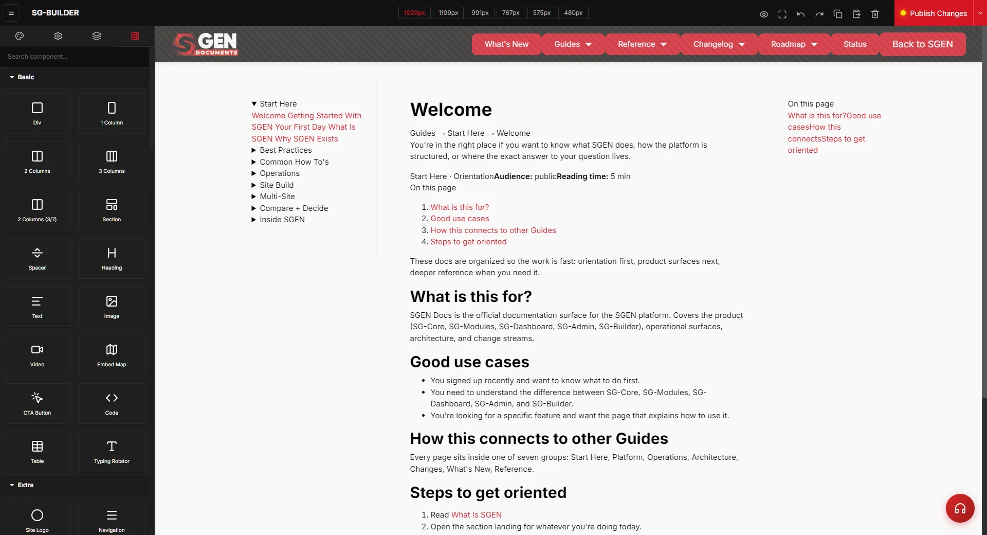
In short. Basic Blocks are the structural backbone of every page in SG-Builder. The category covers the layout containers (Section, the Column presets, Div), the content blocks (Heading, Text, Image, CTA Button), utility blocks (Spacer, Divider), and the media/specialty blocks (Video, Embed Map, Code, Typing Rotator). Every page is a stack of Sections; inside each Section you place a Column layout, and inside the columns you drop content blocks. There is no standalone Grid block — column count is the layout preset you pick, not a separate object.
On this page: Block inventory · How the nesting works · The content blocks in detail · Media and specialty blocks · Composition pattern · Worked examples · Why you edit through traits, not HTML · Troubleshooting · Vocabulary
Basic Blocks is the SG-Builder component category for foundational layout and content primitives. Sections hold the high-level page shape; columns lay out content within sections; headings, text, images, and CTA buttons are the leaf-level content. The category also includes utility blocks (Spacer, Divider) and media blocks (Video, Embed Map, Code, Typing Rotator).
For per-trait configuration detail, see the Components Reference. For specialty blocks, see the sibling categories: Posts Blocks · Ecommerce Blocks · Extra Blocks.
Block inventory
| Block | Role | Notes |
|---|---|---|
| Section | Container | Top-level layout container; pages are a sequence of sections |
| Column | Container | Column-count variant — no separate Grid block |
| Div | Container | Generic container for custom nesting beyond Section/Column |
| Heading | Content | Semantic H1-H6 with typography traits |
| Text | Content | Body text — labeled "Text" in the library (not "Paragraph") |
| Image | Content | Source, alt text, sizing, and decoration traits |
| CTA Button | Content | Click target — labeled "CTA Button" in the library (not "Button") |
| Spacer | Utility | Empty vertical space for breathing room |
| Divider | Utility | Horizontal separator for visual separation |
| Video | Media | Video embed by URL; supports common platforms |
| Embed Map | Media | Location embed by URL or embed code |
| Code | Media | Code or script snippet rendered in a contained block |
| Typing Rotator | Media/Specialty | Animated text that cycles through a list of phrases |
How the nesting works
Every page in SG-Builder is built from the same nesting pattern, and once you see it, the whole editor gets easier to read. Content always lives a few levels deep — it never sits loose on the page.
A Section is the full-width band that runs edge to edge of the browser. It's where you set a background color or background image for that stretch of the page, and where you control the big top-and-bottom spacing between one part of the page and the next. A Section also supports an optional shape divider — the angled or curved edge you sometimes see between two colored bands.
Inside a Section sits a column layout. This is what the "1 Column", "2 Columns", "3 Columns", and "2 Columns (3/7)" blocks give you. When you drag one of these onto a Section, it unfolds into a centered, max-width area holding the right number of side-by-side columns. The column layout is what keeps your text from touching the screen edges and what makes columns stack neatly on top of each other on phones.
Inside each column go your content blocks — the Heading, Text, Image, and CTA Button that visitors read and click.
The "2 Columns" layout stacks to a single full-width column at the tablet breakpoint, so a two-up row automatically becomes a clean one-column layout on smaller screens. You don't configure this — it's built into the column blocks.
The Div block is the exception. It's a plain container you reach for only when you need to wrap a few blocks together for custom styling that the Section/Column layout doesn't cover — most pages never need one, because the column layout already does the wrapping for you.
The content blocks in detail
These four blocks make up the visible text and imagery on almost every page.
Heading. The Heading block holds a title, and you choose its level — H1 through H6 — so search engines and assistive technology read your page structure correctly. Use one H1 per page for the main title, then H2 and H3 for the sections beneath it. A Heading can also be turned into a link if you want the whole title to be clickable.
Text. The Text block is your body copy — paragraphs, lists, and inline formatting. Double-clicking a Text block on the canvas opens a rich-text editor so you can bold a word, add a link, or build a bulleted list without touching any code. (In the library this block is labeled Text, not "Paragraph.")
Image. The Image block places a single picture, with its own alt text and sizing. Alt text matters for both accessibility and SEO, so fill it in for every meaningful image. Like a Heading, an Image can be wrapped in a link.
CTA Button. The CTA Button is the click target you point at a page, a section, or an external URL. It ships with a set of named styles — Default, Primary, Secondary, Success, Warning, Info, Danger, Light, and Dark — plus an outline option that gives you a bordered, transparent-fill version of any style. Set its link, choose whether it opens in the same tab or a new one, and pick the style that matches your brand. (In the library it's labeled CTA Button, not "Button.")
Field reference — the content blocks
| Block | What you set |
|---|---|
| Heading | Heading text · heading level (H1–H6) · optional link |
| Text | Rich-text body (bold, links, lists) via the double-click editor |
| Image | Image source · alt text · sizing · optional link |
| CTA Button | Button text · style (Default / Primary / Secondary / Success / Warning / Info / Danger / Light / Dark) · outline on/off · link + open-in-new-tab |
Media and specialty blocks
Beyond the everyday content blocks, the Basic category includes a few blocks for richer content:
- Video — embeds a video by URL, with controls for autoplay, loop, mute, and whether the player chrome shows.
- Embed Map — drops a location map. Set the place, the zoom level, and the height, and the map renders inline.
- Code — a contained block for a snippet of HTML or a third-party script that has no dedicated block of its own. Use it sparingly: most things you'd reach for code to build already exist as a proper block.
- Typing Rotator — animated text that types out and cycles through a list of phrases (for example, "for Sports… for Marketing… for Business"). You set the list of words, the typing and deleting speed, and how long each word holds before the next.
- Spacer and Divider — Spacer adds a measured block of vertical space; Divider draws a horizontal line. Both are quick ways to separate elements without building a whole new Section.
Composition pattern
A standard page builds up like this:
- Page is a sequence of Sections — each one a full-width band.
- Each Section holds a column layout — pick "1 Column", "2 Columns", "3 Columns", or "2 Columns (3/7)" for the split you want.
- Each Column holds Headings, Text, Images, and CTA Buttons.
- Spacers and Dividers add breathing room between elements without adding a full Section.
- Video, Embed Map, Code, and Typing Rotator drop into a column wherever a media or specialty block is needed.
Worked examples
| You want | How you build it |
|---|---|
| A hero | Section → 1-Column layout → Heading (H1) + Text + CTA Button. Set the Section background, and the hero is done in four blocks. |
| A 3-up feature row | Section → 3-Column layout → in each column, a Heading + Text (and an Image or icon if you like). The columns stack on mobile automatically. |
| An offset image + text | Section → "2 Columns (3/7)" layout → Image in the narrow column, Heading + Text in the wide one. |
| A clean section break | Drop a Divider or a Spacer between two Sections. You get visual separation without building another band. |
| A rotating headline | Section → 1-Column layout → Typing Rotator with your list of phrases, plus a CTA Button below it. |
Why you edit through traits, not HTML
SG-Builder renders most blocks for you. When you change a block's settings — its text, its image, its link — the builder regenerates that block's markup behind the scenes. That's what keeps every block responsive, accessible, and consistent without you writing any code.
The practical consequence: set your content through the block's fields, not by hand-editing HTML. If you paste markup directly into a block's underlying HTML, your edit can be overwritten the next time that block re-renders. The Code block is the one place built for raw HTML — everything else you control through its fields and the rich-text editor. This is why the Basic blocks feel reliable: you're always editing the content, and the builder owns the markup.
Troubleshooting
- My content is touching the edge of the screen. You've likely placed a block directly in a Section without a column layout in between. Drop a "1 Column" (or other) layout into the Section first, then move your content into the column — the column layout is what provides the centered, max-width spacing.
- My two columns aren't stacking on mobile. Use the actual "2 Columns" / "3 Columns" layout blocks rather than improvising with Div containers. The column blocks carry the responsive stacking; a hand-built Div layout doesn't.
- My image looks stretched or oddly cropped. Check the Image block's sizing, and keep one consistent aspect ratio across a row of images. Mixed ratios in the same row are the most common "this looks unfinished" tell.
- My pasted HTML keeps disappearing. That block re-renders from its fields. Put raw HTML in a Code block, or rebuild the content with the proper blocks (Heading, Text, Image) instead.
- My heading isn't showing up in the page outline correctly. Confirm you set the heading level (H1–H6) on the Heading block. One H1 per page, then H2/H3 beneath it.
Vocabulary
- Section — the full-width band; every page is a sequence of sections. Where backgrounds and big vertical spacing live.
- Column layout — the "1 / 2 / 3 Columns" and "2 Columns (3/7)" presets that hold your content and stack responsively. Column count is the preset you pick, not a separate Grid block.
- Div — generic container for custom nesting beyond what Section and the column layouts provide. Rarely needed.
- Text — the body-text block (rich-text via double-click); labeled "Text" in the library.
- CTA Button — the click-target block with named styles and an outline option; labeled "CTA Button" in the library.
- Shape divider — an optional angled or curved edge on a Section, set on the Section itself.
- Leaf block — any non-container block: Heading, Text, Image, CTA Button, Spacer, Divider, Video, Embed Map, Code, Typing Rotator.
Related reading
- Components Reference — per-trait configuration detail for every block.
- Extra Blocks — cards, accordions, forms, sliders, and other composite blocks.
- Posts Blocks — blocks for blog and post templates.
- Ecommerce Blocks — product, cart, and store blocks.