
Build a landing page in SG-Builder
⏱ 2-minute answer below · full tutorial ≈ 12 min · skim the bold lead-ins to move faster.
In short. A landing page has one job: move a visitor toward one action. The layout that does this reliably — hero, features, CTA — is three sections, each with a clear role. This tutorial walks you from a blank page record to a published three-section landing page in SG-Builder: hero with headline + CTA, features in parallel columns, closing CTA that repeats the ask. Six steps, all inside the dashboard. That's the pitch — read on for the step-by-step.
On this page: Before you start · Create the page record · Build the three sections · Breakpoint review · Publish · Troubleshooting
This guide uses SGEN's Agency Partner Program page as the working example — a campaign page for web agencies. The principles apply to any landing page: product launches, event signups, subscription offers, cohort intakes, or referral programs.
Good use cases
| Situation | Hero | Features | CTA |
|---|---|---|---|
| Partner / referral program | Name the offer and the pain it solves | Revenue share, dashboards, onboarding specifics | Application form link |
| Cohort or intake page | Cohort name + intake dates | What members get | Application or RSVP |
| Feature launch | What's new and why it matters | How it differs from before | Signup, demo, or upgrade |
| Event registration | Event name + date | What attendees get | RSVP or registration link |
| Subscription offer | Value proposition | What arrives, how often, at what price | Signup form link |
Not for: blog posts or blog indexes (use the Blog editor), live e-commerce product detail pages (use SGEN's commerce surfaces), or long-form articles where the goal is extended reading rather than a visitor action.
How this connects to other features
- Media — Upload hero background images and feature icons to the Media library before opening the builder. The builder's image picker only shows existing uploads. Full detail: Upload and manage media.
- Custom CSS — Page-specific style overrides use scoped CSS targeting
body.page_id-N. Full detail: Custom CSS basics. - Theme customization — Global typography, color palette, and button styles are set in the Theme Editor. Adjust globals there before overriding per section. Full detail: Theme customization.
- SEO fields — SEO Title and Meta Description live on the page record in Pages, not inside the builder. Set them after publishing (Step 6 below).
- Forms — If your CTA links to a form, that form must exist in the Forms area before you build. Get the form URL or shortcode ready first.
Before you start
Have these ready before opening SG-Builder:
| Item | Notes |
|---|---|
| One visitor action | Every headline and button points at this. Write it down first. |
| Hero headline + subheading + CTA label | Headline names the offer directly. CTA label names the action, not "Learn more." |
| 3-4 features | Each is a concrete benefit with a specific detail — not a category label. |
| Images in Media | Hero background + feature icons uploaded before you open the builder. |
| URL slug | Short and descriptive: agency-partner-program, not a 60-character string. |
Where to go
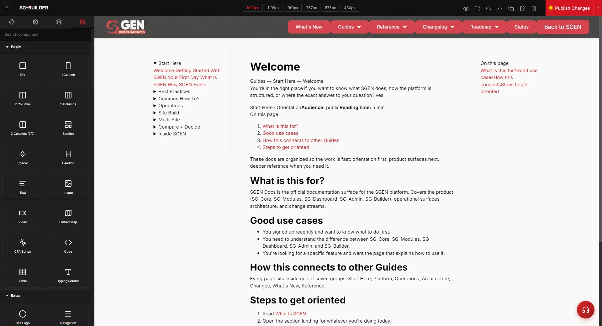
Go to Pages in the left sidebar of your SGEN dashboard. Click Add New Page at the top right. Fill in the Page Title (this becomes the browser tab title and the page record label) and the URL Slug (the public URL path for the page). Save the page record. Then click Open in SG-Builder from the page record view. The builder opens with an empty canvas.
Steps — Build a landing page with hero, features, and CTA
These steps take you from an empty canvas to a published page with all three sections in place.
1. Add the hero section
Click Add Section in the left panel. In the section picker, choose a Hero section type. Hero sections are designed for the top of the page — full width, large heading, and a primary call-to-action button.
In the configuration panel on the right, set:
- Headline — the primary message. Write it for the visitor arriving cold.
SGEN's partner program hero: "Build client sites faster. Bill more. Partner with a CMS that respects your stack." Specific, direct, and addresses the pain of the typical agency sourcing situation.
- Subheading — one sentence that gives the headline context.
"The SGEN Agency Partner Program offers 20% recurring revenue share, white-label dashboards, and dedicated technical onboarding." Under twenty-five words. Names the offer and the benefit.
- Primary CTA button — the label and the destination URL.
"Apply to the Partner Program" linking to the application form. Not "Learn more." Not "Get started." The label names the action.
- Background image — click the image picker and select the hero image from your Media library.
For SGEN's partner program page: a wide photograph of an agency team collaborating around a shared screen showing the SGEN dashboard. Minimum 1440px wide for a full-bleed hero.
After setting the content, use the breakpoint buttons at the top of the canvas to preview the hero at tablet (991px) and mobile (767px and 480px). Hero headlines at desktop often need to be smaller at mobile — configure the font size per breakpoint in the text style panel. Check that the CTA button is accessible and the background image crops to a meaningful subject at narrow widths.
2. Add the features section
Below the hero, click Add Section and choose a multi-column layout — three columns for three features, or a two-by-two grid for four. SGEN's partner program page uses three columns.
For each column, set:
- Icon or image — a small visual anchor for the feature.
Icons from a library or a simple photograph work equally well. For SGEN's partner program page: a revenue-chart icon, a shield-and-lock icon, and a handshake icon.
- Feature heading — three to five words naming the benefit.
"Revenue share that scales. White-label dashboards. Onboarding that sticks."
- Feature body — two to three sentences with the specific detail.
"Earn 20% recurring revenue on every client site you manage on SGEN. No annual commitment in your first three months. Scale to higher tiers as your portfolio grows."
Write each feature so that a reader who skims only the heading and the first sentence still understands the benefit. Most visitors scan before they read. The heading is for scanners. The body is for readers who paused on the heading.
3. Configure features section spacing and alignment
After placing the features section, check three things before moving on.
Column vertical alignment — if the feature headings are different lengths, the icon-heading-body stack will be misaligned across columns. Set the column vertical alignment to top in the section's layout controls so all three columns start at the same point.
Section background — a subtle background color change between the hero and the features section creates visual separation. A light cool off-white (#fff6f6) behind the features section works for SGEN's brand. Set this in the section's background controls.
Mobile stacking order — at mobile widths, three-column sections stack to single column. Switch to the 480px breakpoint and confirm the columns stack in the order you want: feature one at the top, feature three at the bottom. If the stacking order is wrong, adjust the column order in the section's mobile layout settings.
4. Add the closing CTA section
Below the features, click Add Section and choose a CTA or Call to Action section type. This is typically a full-width section with a centered headline, a supporting sentence, and one primary button. No images. No columns. The ask, nothing more.
For SGEN's partner program closing CTA:
- Heading — "Ready to grow your agency on SGEN?"
- Subtext — "Applications take five minutes. You will hear back within two business days."
- CTA button — "Apply to the Partner Program" — the same label as the hero CTA.
Both buttons link to the same application form. Consistent labeling means the visitor knows exactly what they are clicking, regardless of where they are on the page.
Set the CTA section background to a deep brand-aligned dark color — SGEN uses a deep navy. The contrast with the features section creates a visual landing point at the bottom of the page. White text on a dark background works here. Confirm text contrast is readable at all breakpoints.
5. Review the full page layout at every breakpoint
With all three sections placed, run a full breakpoint review before publishing. Use the breakpoint buttons at the top of the SG-Builder canvas: desktop (1920px), wide (1199px), tablet (991px), tablet portrait (767px), and mobile (480px).
At each breakpoint, scroll through the full page and check:
- Hero headline size — large enough to read, not overflowing at narrow widths.
- Features columns — stacking cleanly at mobile, no column clipping or overlap.
- CTA section — button is accessible and full-width at mobile.
- Section spacing — no excessive padding gaps between sections at any width.
- Background colors — hero, features, and CTA backgrounds rendering correctly.
- Images — hero background image cropping correctly at narrow widths.
Fix any issues before publishing. Finding a stacking problem in the builder takes two minutes. Finding it in a live visitor report takes longer.
6. Set SEO fields and publish
Before publishing from SG-Builder, you need to complete one step in the page record.
Return to Pages in the left sidebar and open the Agency Partner Program page record. In the SEO fields:
- SEO Title — "Agency Partner Program — SGEN" (under 60 characters)
- Meta Description — "Web agencies partner with SGEN to deliver client sites faster. 20% recurring revenue share, white-label dashboards, and dedicated onboarding." (under 155 characters)
Save the page record. Then open the page in SG-Builder and click Publish at the top right of the editor. Publishing replaces the live version of the page immediately.
After publishing, open a private browser window and navigate to the page's public URL. Scroll through the whole page as a visitor would. Confirm the hero, features, and CTA are all in place with the correct content. Click the CTA button and confirm it reaches the correct destination.
What success looks like
When the landing page is published correctly, these things are true.
- The page is visible at its public URL in a private browser window without logging in.
- The hero headline, subheading, background image, and CTA button are correct.
- The features section shows three columns with headings and body copy.
- At mobile width (480px), the features columns stack cleanly — no overlap.
- The closing CTA section is visible at the bottom of the page, dark background, white text.
- Clicking either CTA button reaches the correct destination.
- The SEO Title and Meta Description are set on the page record.
- The page title in the browser tab matches the page title you set.
What to do if it does not work
- Hero background image is not displaying.
Confirm the image was selected from the Media library in the hero section's image picker — not referenced by filename only. If the image picker shows the image selected but it is not rendering on the live site, re-open the hero section configuration panel, reselect the image, save, and re-publish.
- Features columns are not stacking on mobile — they are side by side and clipping.
Open SG-Builder on the page, switch to the 480px breakpoint, and check the features section's mobile layout setting. Set the column layout to single-column for the mobile breakpoint. Save and re-publish.
- CTA button is not linking to the correct destination.
Open the CTA section in SG-Builder and verify the destination URL in the CTA button field. Also check the hero section — both CTA buttons should link to the same URL. Make sure the URL is correct (no missing slash, no typo). Save and re-publish.
- The page is not showing as Published in the Pages list after clicking Publish in SG-Builder.
Check the page status in the Pages record. If it still shows Draft, the Publish action may not have completed. Re-open the page in SG-Builder and click Publish again. Confirm the builder shows a published confirmation before closing.
- Section spacing looks inconsistent between desktop and mobile.
Section padding values set at the desktop breakpoint do not automatically carry to mobile. Open SG-Builder, switch to the 480px breakpoint, and check the padding settings for each section under the mobile breakpoint context. Set explicit mobile padding values for the hero, features, and CTA sections. Save and re-publish.
- Text contrast in the CTA section is too low on mobile.
If the dark background and white text look fine on desktop but poor on mobile, check whether any breakpoint-specific color override was inadvertently set. Open the CTA section at the 480px breakpoint and confirm the background and text colors match the desktop settings.
Tips for a strong landing page
- One page, one action.
Landing pages with multiple CTAs — "inquire," "subscribe," "download," and "book a call" on the same page — convert worse than pages with a single, repeated action. Pick one. Repeat it twice: once in the hero, once in the closing CTA.
- Name features, not categories.
"Revenue share" is a category label. "20% recurring on every client site you manage" is a feature. "Onboarding" is a label. "Your dedicated partner manager walks you through your first three client builds" is the receipt. Write the receipt.
- Preview mobile before you write the desktop layout.
Think mobile-first even in a desktop-first editor. The page will be read on phones by more visitors than on desktops. If the mobile layout works, the desktop layout will too.
- Upload images before opening the builder.
Leave the builder to upload images mid-build and you break the flow. All images for the hero and features section should be in Media before you open the editor.
- Verify the CTA link immediately after publishing.
The most common landing page failure is a CTA button that links to the wrong URL — a staging URL, a form that no longer exists, or a typo in the path. Click the CTA button on the published page in a private browser window as the first check.