
Set site-wide colors, typography, and layout
⏱ Quick answer below · full page ≈ 25 min · skim the bold lead-ins to move faster.
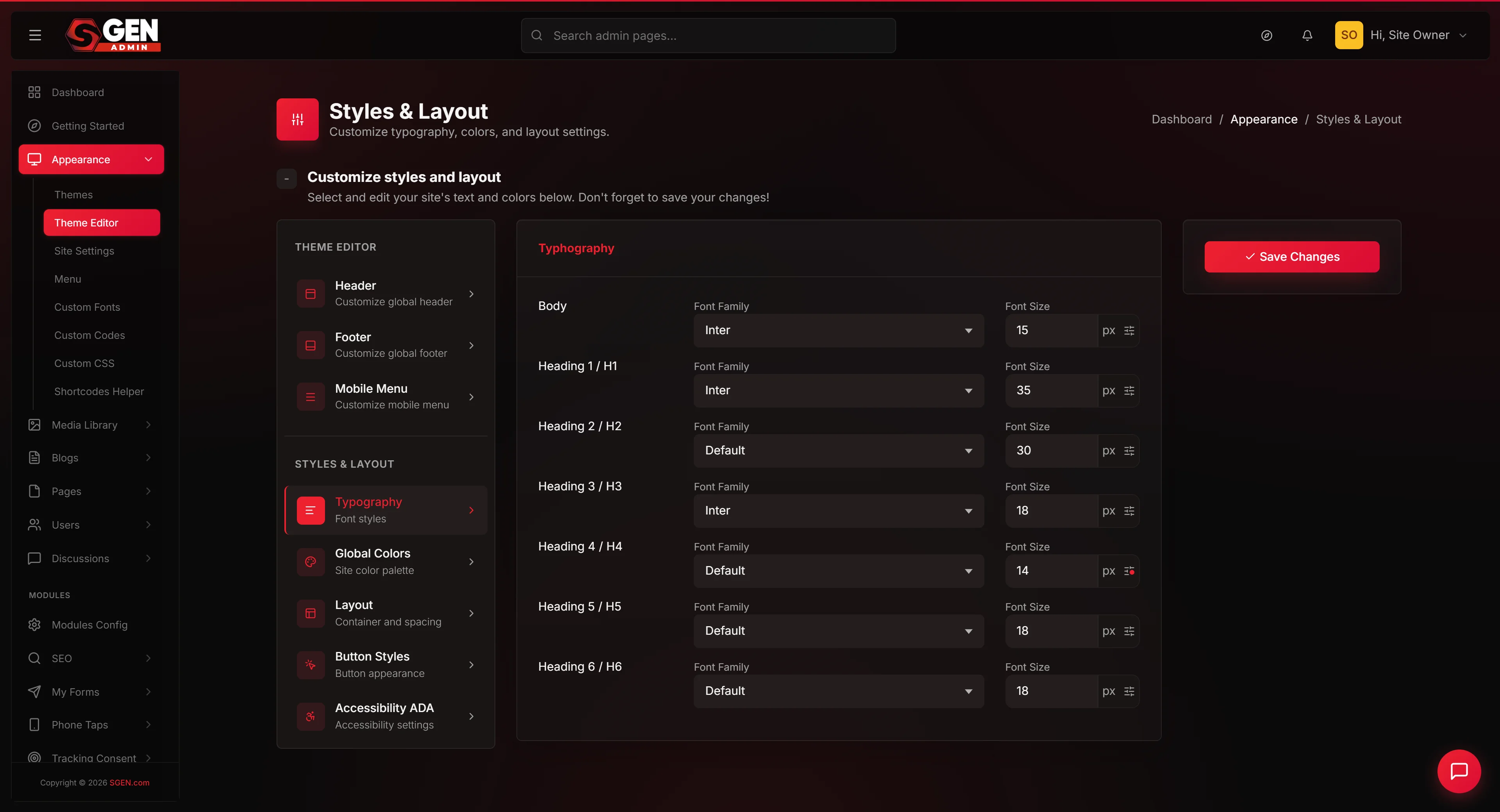
In short. Go to Appearance → Styles & Layouts to set the design tokens that flow through your entire site — body font, heading scale, brand colors, container width, button styles, and the ADA accessibility widget. Five tabs, one Save button. Changes are site-wide and instant.
On this page: What this screen does · Fields reference · Steps per tab · Worked example · Troubleshooting · Known limits
How to set your site-wide colors, typography, and layout defaults
What is this for?
The Styles & Layouts screen — sometimes called the Theme Editor in conversation — is the single place where you set the design tokens that flow through your entire site. Body font. Heading scale (H1 through H6). Primary brand color. Secondary brand color. Container max width. Section padding. Button styles (border radius, padding, font weight). Accessibility integration. These tokens are the foundation underneath every page, every blog post, every component. When you change a token on this screen, every page on your public site picks up the change.
The screen has five tabs along the top: Typography, Global Colors, Layout, Button Styles, and Accessibility (ADA). Each tab is a distinct configuration area, but every tab feeds the same underlying set of design tokens. One Save button at the bottom of the screen commits every change you've made across all five tabs at once. That's the unique behavior of Styles & Layouts: you can edit Typography, then click Global Colors, then click Layout, change something on each, and a single Save commits the entire batch.
The site-wide tokens you set here are the design system. Per-page or per-component overrides happen elsewhere — in the page builder for individual pages, in the per-component sidebar for individual blocks. Styles & Layouts is the foundation you build on top of.
Scope
Styles & Layouts owns five tabs: Typography, Global Colors, Layout, Button Styles, and Accessibility (ADA). Every change flows through every page, every blog post, and every component. Per-page or per-component overrides happen elsewhere (page builder or component sidebar) and are not managed here.
What NOT to use this for
- Don't use this for per-page color or typography overrides. Every change here flows through every page. To override on a single page (or single component), use the page builder's per-component fields or the per-page settings.
- Don't paste arbitrary CSS here. The fields accept hex values, font picker selections, and numeric inputs. For arbitrary CSS, use Sidebar → Custom CSS.
- Don't use Styles & Layouts as a one-off "design tweak". Changes here affect the entire site. Always test on a representative page after saving — what looked good as an isolated change can shift the layout on pages you didn't preview.
- Don't expect changes here to override per-component overrides. If a Heading component on a specific page has its own font assigned in the page builder, that override beats the global Styles & Layouts setting for that one component. Global tokens are the foundation; per-component overrides are exceptions.
- Don't disable Accessibility without a replacement plan. If you turn off the ADA widget without enabling another accessibility solution, your site loses compliance support. Talk to your legal team before disabling.
- Don't expect a preview pane on this screen. Styles & Layouts shows fields, not previews. To see how your changes look, save and visit the public site (or the page builder on a representative page).
Fields
| Tab | Field | What it controls | Public-site impact |
|---|---|---|---|
| Typography | Body font | Font family for paragraphs, lists, body-copy blocks | Every paragraph across every page |
| Typography | H1–H6 size + font | Font family and pixel size per heading level | Every heading element site-wide |
| Typography | Line height (body + headings) | Vertical spacing between text lines | Readability across all copy blocks |
| Global Colors | Primary color | Main brand accent — button backgrounds, links, CTAs | Buttons, links, accent elements everywhere |
| Global Colors | Secondary color | Secondary accent — complementary to primary | Secondary buttons, decorative accents |
| Global Colors | Named slots (Tertiary, Surface, Background, Border) | Additional brand color slots exposed by your theme | Theme-specific usage per slot |
| Layout | Container max width | Maximum visible width of content sections (px) | Every content container on every page |
| Layout | Section padding | Vertical + horizontal inset for section blocks | Spacing between sections across all pages |
| Button Styles | Border radius | Corner rounding for buttons (0px = sharp, 999px = pill) | Every CTA and form button site-wide |
| Button Styles | Button padding | Top/bottom and left/right internal button spacing | Button size and feel across the site |
| Button Styles | Button font + weight | Typeface and weight for button labels | Button label legibility and brand alignment |
| Accessibility (ADA) | Widget toggle | On/off for the accessibility-toolbar icon | Adds the toolbar icon to every public page |
| Accessibility (ADA) | Integration key | Provider key for your ADA compliance service | Connects the widget to your provider account |
How this connects to other features
- Custom Fonts — every font available in the Typography font dropdown is either a system font, a Google Font, or a custom font registered under Sidebar → Custom Fonts. Register custom fonts there first; they appear in the picker here.
- Theme Editor → Header / Footer / Mobile Menu — chrome surfaces inherit the typography and color tokens from Styles & Layouts as their defaults. You can override per-surface (e.g. a Footer with a different font), but in the absence of an override, the chrome uses the tokens you set here.
- Custom CSS — for design tweaks that go beyond the fields exposed here (e.g. a complex multi-column layout, custom keyframes, animation), use Sidebar → Custom CSS.
- Page Builder — pages built in the page builder use the global tokens as their defaults. Heading components default to the H1-H6 scale, button components default to the button styles, container components default to the layout settings.
- Pages — every page on your site renders with the tokens set here as its foundation. Page-level overrides exist but should be rare.
- Blog posts — blog post bodies render with the body font, paragraph spacing, and link colors set here.
- Form Builder — forms inherit the typography and button styles from Styles & Layouts.
Before you start
- Have your brand values ready. Primary and secondary colors (hex), fonts (system, Google, or custom), heading scale (H1–H6 sizes), container width, section padding, and button styles.
- Register custom fonts first. If you're using a self-hosted face, register it under Sidebar → Custom Fonts before opening Styles & Layouts — the picker won't show it otherwise.
- Screenshot your current values before a major change. There is no undo — knowing what to roll back to is your safety net.
- Test on multiple representative pages after saving. A change that looks good on the homepage can shift a content-heavy blog post page. Check at least three pages on the public site.
Steps — Set up the Typography tab
1. Open Styles & Layouts
Click Sidebar → Appearance → Styles & Layouts. The screen loads with Typography active. Tab switches update the URL but preserve your unsaved changes across all five tabs — a single Save at the bottom commits everything. A hard refresh before saving will lose your changes.
2. Pick the Body font
Click the Body font field. The font picker opens. Pick the font that should render every paragraph, list, and body-copy component across your site. Common choice: Inter (Google), Roboto (Google), or your custom face.
3. Set the body font size
Type a pixel value into the Body font size field. Common values: 16px (compact), 18px (default), 20px (relaxed). The body size is the base; heading sizes scale up from it.
4. Pick H1-H6 fonts (each can be different from body)
Each heading row has its own font field. Most brands use the same font for H1-H4 and a different font for H5-H6, or use one font for all headings. Pick what fits your brand.
5. Set H1-H6 sizes
Each heading row has a size field. A common, balanced scale:
- H1: 60px
- H2: 46px
- H3: 36px
- H4: 24px
- H5: 20px
- H6: 18px
For more dramatic hierarchy, scale up: H1=72px, H2=56px. For tighter editorial: H1=48px, H2=36px.
6. Set line heights
The Body line height (1.6 is a common default) controls spacing between paragraph lines. Headings line height (1.2 is tighter) controls heading line spacing. Adjust to taste.
7. Switch tabs or save
Click Global Colors to continue editing on another tab without saving — your Typography changes persist as you navigate between tabs. Or click Save to commit just Typography for now and return later for the other tabs.
Steps — Set up the Global Colors tab
1. Click the Global Colors tab
The screen switches to color configuration.
2. Set the Primary color
The Primary color is your brand's main accent — used for default button backgrounds, link colors, primary CTAs, and accent elements. Type a hex value into the Primary field, or click the color swatch to open the color picker.
3. Set the Secondary color
The Secondary color is used for less-prominent accents and secondary buttons. It often complements the Primary — analogous, complementary, or neutral.
4. Set named brand color slots
Many themes expose additional named slots: Tertiary, Surface, Background, Border, Success, Warning, Error. Set each to a hex value that fits your brand and accessibility standards.
5. Verify color contrast
Tap each color into a contrast-checking tool. Make sure Primary text on a white background passes at least AA standards. Make sure white text on the Primary background passes too.
6. Switch to the next tab or save
Steps — Set up the Layout tab
1. Click the Layout tab
2. Set the container max width
Type a pixel value into the Container max width field. Common values:
1200px— compact, magazine-style1280px— common default1440px— wide, agency-style1600px— very wide, B2B catalog
The container max width is the maximum visible width of any content section. On wider viewports, content sits centered in a container of this width.
3. Set section padding
Section padding is the space between section blocks vertically (top and bottom) and the inset (left and right). The default 50/0/50/0 reads as: 50px top, 0px right, 50px bottom, 0px left.
4. Switch to the next tab or save
Steps — Set up the Button Styles tab
1. Click the Button Styles tab
2. Set the button border radius
Type a pixel value. Common values:
0px— sharp, modernist4px— slightly rounded, default8px— visibly rounded12px-16px— soft, friendly999px— pill-shaped
3. Set the button padding
Type values for top/bottom and left/right. A common default: 12px 24px. For larger CTAs: 16px 32px. For tighter buttons: 8px 16px.
4. Set the button font
Many brands use the body font for buttons. Some use a heavier weight (600 or 700) to make CTAs more prominent.
5. Set button colors
Often the button background uses the Primary color (set on the Global Colors tab) and the button text is white.
6. Switch to the next tab or save
Steps — Set up the Accessibility (ADA) tab
1. Click the Accessibility (ADA) tab
2. Toggle the ADA widget on
The toggle controls whether your site shows the accessibility-toolbar icon in the bottom corner of every public page.
3. Paste the integration key
If your accessibility provider gave you an integration key, paste it into the integration-key field.
4. Confirm the widget renders
Save (at the bottom of the screen). Open the public site. The accessibility-toolbar icon should appear in the bottom corner.
5. Test the widget
Click the icon. The accessibility toolbar should open, exposing controls for font size, contrast, animations, and other compliance options.
6. Save
Steps — Save all five tabs at once
1. Make changes across multiple tabs
Edit Typography, then click Global Colors and edit there, then click Layout, then Button Styles, then Accessibility (ADA). Don't save between tab switches — the changes persist in the form.
2. Click Save at the bottom of the screen
The Save button is below all the tabbed content. One click commits every change across every tab.
3. Verify the green save banner
A flash banner confirms the save: "Styles & Layouts saved."
4. Visit the public site to verify
Refresh a representative page. Every change you made — body font, heading sizes, primary color, container width, button radius, accessibility widget — should be visible.
What success looks like
A successful Styles & Layouts save produces:
- The Save button flashes a green confirmation banner.
- The public site picks up the new design tokens on the next page load (hard-refresh if you see cached content).
- Typography changes flow through every page: every paragraph uses the new body font and size, every H1 renders at the new size in the new heading font.
- Color changes flow through buttons, links, and accent elements. Brand identity feels coherent across pages.
- Layout changes affect every container and every section. Wider containers let content breathe; tighter ones increase density.
- Button changes affect every CTA across the site simultaneously.
- Accessibility widget appears as a small icon in the corner of every public page.
- Per-page overrides preserved. If you had per-page font or color overrides, those remain in place.
What to do if it does not work
My typography changes don't appear on the public site
- Hard-refresh the public site. Press Ctrl+Shift+R (Cmd+Shift+R on Mac). A cached page can still show the old fonts.
- Confirm the font is loaded. Open the public site and check that the font family is loading. If a Google Font fails to load (network issue, wrong name), the page falls back to the system font.
- Confirm you saved Styles & Layouts. Re-open Styles & Layouts → Typography. The fields should show your new values. If they reverted, the save didn't go through.
- Check for per-page overrides. A page that has a per-component font override won't pick up the new global font. Open the page in the page builder and check whether components have their own font assigned.
Colors look wrong on the public site
- Check the hex value you entered. A typo in the hex (
#d5152instead of#d51522) silently fails. Re-open the field and confirm. - Check contrast. A dark text on a dark background is "saved correctly" but visually invisible. Re-evaluate your palette in a contrast checker.
- Check for theme-level overrides. Some themes apply additional CSS rules that override the global colors in specific components. Inspect the page in the browser to see which CSS rule is winning.
Container width change doesn't take effect
- Confirm the new value is in pixels. Type
1440px, not1440. The platform may interpret a unitless number differently. - Check whether the page is using the global container. Pages built with custom layouts may have their own container settings that override the global.
My button radius change doesn't apply to all buttons
- Some components define their own button radius. A theme-supplied "Hero CTA" component may have hard-coded button styling that ignores the global. To force consistency, override at the component level or use Custom CSS.
- Confirm you saved on the Button Styles tab. A common mistake: making changes on the tab but forgetting to click Save before navigating away.
The Accessibility widget doesn't show up
- Confirm the toggle is on. Re-open Styles & Layouts → Accessibility (ADA). The toggle should be in the on position.
- Confirm the integration key is correct. A wrong key fails to render the widget.
- Hard-refresh the public site. A cached page won't show the new widget.
My typography looks slightly off
- Check whether your custom font is fully loaded. If a custom font has multiple weights and one weight failed to upload, the browser falls back to a system substitute for that weight.
- Check the line height settings. A line height of
1.6(default) reads cleanly;2.0adds a lot of space;1.0cramps lines. Adjust to taste. - Inspect the page. Open the public site, right-click the text, "Inspect element". The browser shows you the actual rendered font, size, weight, and line height.
Example 1: Your Store does a complete brand pass in 45 minutes
Your Store is launching a brand refresh. Their design lead has approved a new direction.
Their workflow:
- They open Sidebar → Custom Fonts and upload Your Store Serif with weights 400 and 700. They save.
- They open Sidebar → Appearance → Styles & Layouts.
- Typography tab: Body font = Inter, body size = 18px. H1 font = Your Store Serif, H1 size = 60px. H2 = 46px (Your Store Serif). H3-H6 = same Your Store Serif at 36/24/20/18.
- Global Colors tab: Primary =
#d51522(brand red), Secondary =#1a1a1a(charcoal), Background =#ffffff, Surface =#fafafa. - Layout tab: Container max width = 1280px. Section padding = 80/0/80/0.
- Button Styles tab: Border radius = 8px. Padding = 12px 24px. Font = Inter at weight 600.
- Accessibility (ADA) tab: Toggle on. Integration key pasted from their compliance provider.
- They click Save. The whole batch commits in one action.
- They open three representative pages on the public site: homepage, product detail, blog post. Each renders with the new tokens. The brand feels coherent.
Outcome:
A complete brand refresh applied site-wide in one session. No per-page edits. Every existing page picks up the new identity automatically.
Other common scenarios
| Change | Tab | How long |
|---|---|---|
| Swap body font from Lato to Crimson Pro | Typography → Body font dropdown | ~90 seconds |
| Tighten heading scale (H1 72px → 56px, H2 56px → 40px) | Typography → H1/H2 size fields | ~5 minutes |
| Widen container from 1200px to 1440px for a denser catalog | Layout → Container max width | ~2 minutes |
| Roll back a button radius from 24px to 8px | Button Styles → Border radius | ~1 minute |
| Set a temporary holiday color scheme and restore after the campaign | Global Colors → Primary + Secondary (screenshot first) | ~2 minutes each way |
Key lesson for all of these: save, then check at least three representative pages on the public site. A token change that looks right on the homepage can shift the rhythm of a content-heavy page you didn't preview.
Known limitations
- No live preview. The screen shows fields, not previews. To see the impact, save and visit the public site.
- No per-tab save. A single Save button commits all five tabs together. To save just one tab's changes, make the change on that tab, click Save, then come back later for the next tab.
- Per-component overrides beat global tokens. A page-builder component with a hard-coded font assignment will not change just because you changed the global.
- Some changes need a hard refresh. The public site may serve cached pages briefly after a save. A hard refresh (Ctrl+Shift+R / Cmd+Shift+R) shows the latest tokens.
- No undo. If you save bad values, the only way to restore is to manually re-enter the previous values. Always screenshot before a major change.
- Theme-supplied components may not respect every token. A custom theme might define hardcoded button styles or font assignments inside its components. Those won't pick up your global Button Styles changes.
Next steps
- Pick a font from the font selector — how the Typography tab font picker works.
- Edit your site header — chrome-level fonts and colors that can override Styles & Layouts on the header surface.
- Edit your site footer — footer chrome configuration.
- Edit your mobile menu — mobile drawer chrome.
- Browse and preview themes — change the active theme before setting your tokens.
Styles & Layouts fields by tab
| Tab | Field | What it controls | Public-site impact |
|---|---|---|---|
| Typography | Body font | Font family for paragraphs, lists, body-copy blocks | Every paragraph across every page |
| Typography | H1–H6 size + font | Font family and pixel size per heading level | Every heading element site-wide |
| Typography | Line height (body + headings) | Vertical spacing between text lines | Readability across all copy blocks |
| Global Colors | Primary color | Main brand accent — button backgrounds, links, CTAs | Buttons, links, accent elements everywhere |
| Global Colors | Secondary color | Secondary accent — complementary to primary | Secondary buttons, decorative accents |
| Global Colors | Named slots (Tertiary, Surface, Background, Border) | Additional brand color slots exposed by your theme | Theme-specific usage per slot |
| Layout | Container max width | Maximum visible width of content sections (px) | Every content container on every page |
| Layout | Section padding | Vertical + horizontal inset for section blocks | Spacing between sections across all pages |
| Button Styles | Border radius | Corner rounding for buttons (0px = sharp, 999px = pill) | Every CTA and form button site-wide |
| Button Styles | Button padding | Top/bottom and left/right internal button spacing | Button size and feel across the site |
| Button Styles | Button font + weight | Typeface and weight for button labels | Button label legibility and brand alignment |
| Accessibility (ADA) | Widget toggle | On/off for the accessibility-toolbar icon | Adds the toolbar icon to every public page |
| Accessibility (ADA) | Integration key | Provider key for your ADA compliance service | Connects the widget to your provider account |