
Browse and preview themes for your site
⏱ 60-second answer below · full reference ≈ 8 min · skim the bold lead-ins to move faster.
In short. The Themes screen (Sidebar → Appearance → Theme Editor → Themes) is a read-only gallery where you browse pre-built theme cards for seven chrome surfaces — Header, Footer, Blog Archive, Location Selections, Age Verification, Global Buttons, and Sticky-Mobile-Bottom CTA — plus Style Presets that flip your entire site's colors and typography at once. Browsing is safe: nothing changes on your live site until you click Save. Style Preset activation triggers a confirmation dialog because the impact is site-wide. That's the workflow — read on for the full surface reference.
On this page: What it covers · Surface + preset table · Step-by-step browsing · What success looks like · Troubleshooting
How to browse and preview themes for your site
What is this for?
The Themes screen is a gallery, not a configurator. You browse pre-built theme cards for the chrome surfaces of your site — the parts that wrap your content rather than the content itself: Headers, Footers, Blog archive layouts, Location selectors, Age verification splash screens, Global button shapes, and the Sticky-mobile bottom-bar CTA. Separately, the Style Presets view shows coordinated bundles of colors and typography that flip the entire visual identity of your site at once.
Browsing is non-destructive. Selecting a card records your choice but does not apply it. Your live site changes only when you click Save. Style Presets show an extra confirmation dialog before applying because the impact is site-wide. The Themes screen is the first stop when you're starting fresh, exploring a brand refresh, or comparing options before committing — activate separately (see Activate a different theme).
Scope
The Themes picker covers seven chrome surfaces (Header / Footer / Blog Archive / Location Selections / Age Verification / Global Buttons / Sticky-Mobile-Bottom CTA) and a Style Presets gallery. The picker is read-only in terms of your live site — browsing and selecting a card does not commit anything. Activation (the actual live-site change) is a separate Save action. This doc does not cover the per-token refinements inside an activated theme (see Edit your site header / footer / mobile menu) or global design tokens (see Customize global styles).
Examples
Good use cases
| Situation | What to do on the Themes screen |
|---|---|
| Brand relaunch — new Header layout | Open the Header tab, browse the five cards, pick the layout that fits the new identity |
| Full brand reset — new colors + typography | Open the Style Presets view (?tab=style-presets), pick a preset, confirm the dialog |
| Pre-launch Footer decision | Open the Footer tab, compare the four card thumbnails with your team |
| B2B resource library — editorial blog layout | Open the Blog Archive tab, choose List / Card Grid / Magazine Style |
| Age-gated product line | Open the Age Verification tab, pick the light or dark splash-screen theme |
| Holiday campaign — mobile bottom-bar CTA | Open the Sticky-Mobile-Bottom CTA tab, pick a CTA-bar style before wiring the content |
What NOT to use this for
- Don't use this to write CSS or override individual styles. The Themes screen activates pre-built themes only. Per-token tuning (colors, fonts, padding) lives in Sidebar → Appearance → Styles & Layouts.
- Don't expect to install new themes from this screen. The themes shown here ship with the platform. There's no upload-a-theme button — the catalog is curated.
- Don't activate a Style Preset without warning your team. A Style Preset flips colors and typography across the entire site at once. If your team has tuned individual buttons, headings, or section colors via Styles & Layouts, the preset overwrites those tunings on activation. The picker shows a confirmation dialog warning about this — read it before clicking confirm.
- Don't use the Themes screen to add menu items. Menu items themselves come from Sidebar → Appearance → Menu Builder. The Themes screen styles the chrome that holds the menu — but the items themselves are managed elsewhere.
- Don't try to tweak a theme card's individual fields here. Each theme card is a coherent bundle. To tune the colors, fonts, and individual decisions inside an active Header theme, use Theme Editor → Header. Themes is for picking; the individual editor screens are for refining.
- Don't browse Themes during peak business hours if your team plans to activate one. Browsing is safe — but if you want to activate a Style Preset, the change ripples site-wide on the next page load. Schedule the activation for off-hours and notify your team.
Fields
| Surface tab | Available cards | Style Preset impact |
|---|---|---|
| Header | 5 layout variants | Style Preset overrides header palette but not layout card |
| Footer | 4 layout variants | Style Preset overrides footer palette but not layout card |
| Blog Archive | 3 layout variants | Style Preset does not override blog archive layout card |
| Location Selections | 2 variants | Style Preset does not override location selector card |
| Age Verification | 2 variants | Style Preset does not override age verification card |
| Global Buttons | 3 shape variants | Style Preset overrides button palette |
| Sticky-Mobile-Bottom CTA | 4 variants | Style Preset overrides CTA palette |
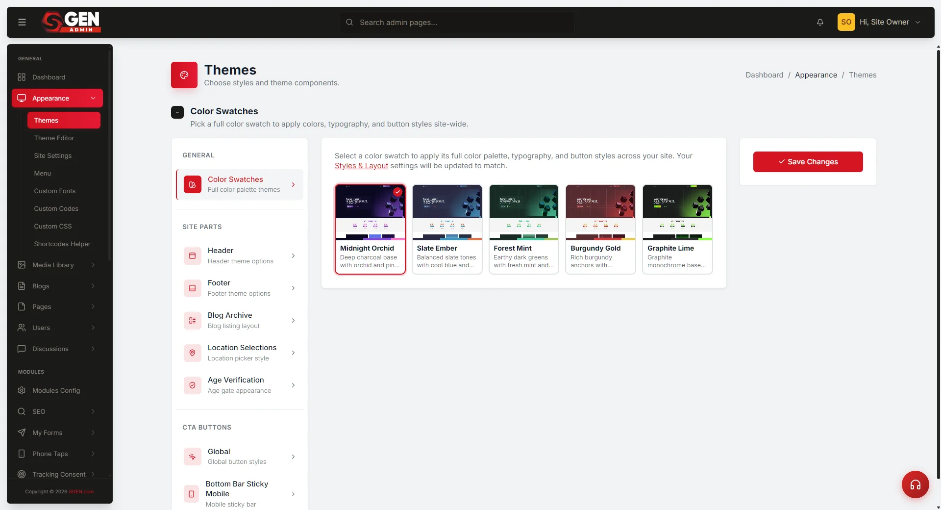
| Style Presets | 5 presets (Midnight Orchid, Slate Ember, Forest Mint, Burgundy Gold, Graphite Lime) | Overrides colors + typography sitewide |
Browsing is non-destructive — selecting a card records your choice in the UI but does not apply until you click Save.
How this connects to other features
- Activate a different theme — the Themes screen is the gallery; the actual flip happens through the activate-theme action documented separately. The activate doc covers the confirmation dialog, the public-site impact, and how to recover if you change your mind.
- Header / Footer / Mobile Menu / Styles & Layouts — once you've activated a theme card here, the corresponding individual editor lets you tune the colors, fonts, and content within that theme. Themes picks the bundle; the editors refine inside it.
- Style Presets and Styles & Layouts — activating a Style Preset overrides the per-token settings stored in Styles & Layouts. After preset activation, you can re-tune individual tokens in Styles & Layouts on top of the preset's foundation.
- Custom Fonts — the typography choices baked into each theme and Style Preset reference fonts available in your Custom Fonts catalog. Some themes ship with their own font picks; activating a theme that uses a font you don't have installed falls back to a system font.
- Menu Builder — every Header theme renders the menu items you've assigned to the Header location in Menu Builder. The theme styles the wrapper; Menu Builder fills it.
- Age Verification — the Age Verification theme cards style the splash screen. To turn the age gate on or off and configure the verification logic, look for the dedicated Age Verification settings screen.
Before you start
- Decide whether you're browsing or committing. If you want to see what's available, click around the sidebar tabs and look at thumbnails. No saving is required while browsing — the live site doesn't change until you activate.
- Plan a window for activation. Activating a theme card refreshes one chrome surface (e.g. the Header). Activating a Style Preset refreshes the entire site visually. Pick a low-traffic window and notify the team if relevant.
- Save your current configuration first if you're attached to it. If you've heavily tuned the current chrome — a custom Header palette, custom button radius, custom typography — capture screenshots before activating something else, so you can replicate the tunings later if needed.
- Have your design lead's pick ready. Browsing 5 Header themes plus 5 Style Presets gives a lot of choice. Save time by deciding in advance which themes are "in scope" and only activating one of those.
- Know the difference between a theme card and a Style Preset. A theme card is the chrome layout for one surface (Header, Footer, etc.). A Style Preset is the global colors-plus-typography bundle. Theme cards are local; Style Presets are global. Both are activated from this screen, but the impact differs.
- Test on a representative page after activation. A theme that looks great on the homepage may render unexpectedly on a content-heavy blog post or a deep e-commerce category page.
Where to go
- Click Sidebar → Appearance → Theme Editor.
- Click Themes in the Theme Editor's left-side navigation.
- The Themes screen loads with the Header tab open by default.
- The left sidebar lists the seven sections you can browse: Header, Footer, Blog Archive, Location Selections, Age Verification, Global Buttons, Sticky-Mobile-Bottom CTA.
- Click any sidebar tab to switch to that section's gallery. Each tab shows the theme cards available for that surface.
- To browse the Style Presets view, append
?tab=style-presetsto the page address. There's currently no sidebar entry for this view — it's reachable but unannounced. - Each theme card is a radio button with a thumbnail preview, the theme name, and a description.
- Make a selection in any tab; the picker remembers your selection across tab switches.
- Click Save at the bottom to commit the activation. If you've selected a Style Preset, a confirmation dialog appears warning that activation overrides your per-token color and typography settings.
Steps — Browse the Header gallery
1. Open the Themes screen
Click Sidebar → Appearance → Theme Editor → Themes. The Themes screen loads. By default the Header tab is open and you see the gallery of Header theme cards.
2. Look at the thumbnails
Each theme card shows:
- A small preview image of how the Header will look (logo position, menu position, CTAs visible or not).
- The theme name (e.g. "Logo Left + CTAs").
- A short description of what the layout emphasizes.
- A radio circle indicating whether this card is currently selected.
The currently active Header theme has its radio circle filled. The others are unfilled until you click them.
3. Compare the cards by clicking each one
Clicking a card selects it (the radio circle fills). The card you click does not activate yet — it's a pending selection that becomes real only when you click Save.
If you click a different card, the previous selection un-fills and the new one fills. So you can browse, compare mental models, and back out without committing.
4. Decide whether to commit, switch tabs, or back out
- Commit: Click Save at the bottom. The selected Header theme activates and the public site refreshes.
- Switch tabs: Click Footer (or any other sidebar tab) to compare what's available in another section. Your Header selection is preserved as you navigate.
- Back out: Navigate away from the Themes screen without clicking Save. No changes apply.
Steps — Browse Style Presets
1. Open the Style Presets view
In the address bar, append ?tab=style-presets to the page address and press Enter. The Themes screen reloads with the Style Presets gallery visible.
There's no sidebar entry for Style Presets right now — the team is iterating on the catalog before adding one. The view is reachable, but unannounced.
2. Browse the five preset bundles
Each preset shows:
- A larger preview image showing how the colors and typography combine.
- The preset name (Midnight Orchid, Slate Ember, Forest Mint, Burgundy Gold, Graphite Lime).
- A short description of the design language.
- A radio circle.
3. Imagine each preset on your existing pages
Style Presets flip global colors and typography across the entire site. Picture how each one would render on:
- Your homepage hero
- A blog post detail page
- An e-commerce category grid
- The checkout flow
- Form fields and buttons
4. Select a preset, save, confirm
Click the radio circle on your chosen preset. Click Save at the bottom of the screen. A confirmation dialog appears: "Update Theme Editor? Saving with a style preset selected will update your Styles & Layout (Theme Editor) settings." Read the dialog. If you're sure, confirm. The preset's colors and typography activate across the site.
If you cancel the dialog, no change applies. The site continues with whatever was active before.
Steps — Browse multiple sections in one session
1. Open the Themes screen
Click Sidebar → Appearance → Theme Editor → Themes.
2. Make a Header selection
Click your preferred Header theme card. The radio circle fills.
3. Switch to the Footer tab
Click Footer in the left sidebar. Your Header selection is preserved (it's stored in a hidden field; switching tabs does not lose it).
4. Make a Footer selection
Click your preferred Footer theme card.
5. Switch to Global Buttons
Click Global Buttons. Pick the button shape you want.
6. Click Save once
The Save button at the bottom commits all three selections (Header + Footer + Global Buttons) in one action. The public site refreshes with all three changes on the next page load.
This batch behavior is the main reason to use the Themes screen as a session-level browsing tool, not a per-tab edit tool.
What success looks like
A successful theme save produces:
- A green confirmation banner at the top of the screen ("Themes updated").
- The selected theme cards show their radio circles filled when you re-open the screen — confirming the activation persisted.
- The public site renders the new chrome themes on every page on the next page load. Hard-refresh if you're seeing cached content.
- For Header changes, the public Header layout shifts immediately — logo position, menu position, and CTA placement all update.
- For Footer changes, the public Footer renders with the new layout (column counts, alignment, spacing).
- For Style Preset activations, every button, link, heading, and paragraph on every page picks up the preset's colors and typography. The change is dramatic and immediate.
- For Blog Archive changes, your blog landing page renders with the new layout (list, grid, or magazine).
What to do if it does not work
My theme selection didn't save
- Re-open the Themes screen. Confirm the radio circle on your selected card is filled. If it's not, the save didn't persist. Make the selection again and click Save.
- Check for a confirmation dialog you may have dismissed. If you selected a Style Preset, a confirmation dialog may have appeared and been dismissed without confirming. Re-select and confirm.
- Confirm you clicked Save. The Save button is at the bottom of the screen, below all the theme cards. Scroll down if needed.
The public site doesn't show the new theme
- Hard-refresh the public site. Press Ctrl+Shift+R (Cmd+Shift+R on Mac). Cached pages can show the old theme.
- Wait a moment. Some hosting setups cache aggressively. The new theme may take 30-60 seconds to propagate.
- Check the right surface. If you activated a new Footer theme, the Header is unchanged. Scroll down to confirm the Footer reflects your selection.
- Check the right site. If you manage multiple sites, confirm you activated the theme on the site you're viewing.
A theme card is missing from the gallery
- Refresh the Themes screen. Sometimes the gallery loads partially. Reload the page.
- Confirm the catalog hasn't changed. Themes ship with the platform. If a theme you used previously isn't visible, the platform may have retired it. Pick the closest available theme.
A Style Preset I activated didn't change my site as expected
- Confirm you confirmed the dialog. If you cancelled the confirmation dialog, no change applied.
- Check Styles & Layouts. A Style Preset writes default tokens to Styles & Layouts. Open that screen to confirm the new tokens are present. If they aren't, the preset activation didn't complete; re-do it.
- Per-component overrides survive preset activation. If specific pages have per-component color or font overrides, those overrides win on those pages.
The Style Presets tab isn't visible in the sidebar
- This is by design. The Style Presets view is reachable by appending
?tab=style-presetsto the page address. There's no sidebar link yet.
A theme that worked yesterday looks different today
- Check whether someone activated a Style Preset. A teammate activating a preset overrides global colors and typography across the site, including any chrome themes' default colors.
- Check Styles & Layouts. Token changes made there flow into the active themes.
- Restore the previous configuration. Re-activate the previous Style Preset, or manually re-tune the affected tokens in Styles & Layouts.
Example: Activating a Style Preset for a complete brand reset
Your site has been live for two years. The design lead wants a clean visual slate to rebuild from. The plan: activate Burgundy Gold, then refine on top.
Workflow:
- Open Theme Editor → Themes, then append
?tab=style-presetsto the page address and reload. - Scroll through the five preset bundles. Burgundy Gold fits: deep burgundy primary, warm gold accents, elegant display headings.
- Click the radio circle on Burgundy Gold, then click Save.
- A confirmation dialog appears: "Update Theme Editor? Saving with a style preset selected will update your Styles & Layout (Theme Editor) settings." Take a screenshot of the current config first in case you want to revert, then confirm.
- The public site refreshes — every page picks up the new colors and typography.
Outcome: Coherent new identity in 5 minutes. Fine-tune individual tokens (line height, button radius) in Styles & Layouts on top of the preset's foundation.
Theme card vs Style Preset — quick reference
- Theme card — affects one chrome surface (Header / Footer / Blog Archive / etc.). Each surface has its own gallery. Activations are local to that surface.
- Style Preset — affects global colors and typography across the entire site at once. Activations cascade into Styles & Layouts and override per-token tunings.
- Confirmation behavior — theme cards activate on Save without an extra dialog. Style Presets show a confirmation dialog warning about the global impact.
- Where the activation lives — theme cards activate the surface bundle. Style Presets activate global tokens.
Known limitations
- No upload-a-theme button. The catalog ships with the platform. New themes appear when the team adds them to the catalog and the platform updates.
- Style Presets is currently a hidden tab. The view is reachable by appending
?tab=style-presetsto the page address. The sidebar entry is intentionally hidden while the team iterates on the catalog. - Theme card thumbnails are static. They give a sense of the layout but don't reflect your actual content. Always preview the result on the public site after activating.
- No revert button. If you activate a theme and don't like it, the way back is to activate a different theme card. There's no automatic "undo" that restores yesterday's configuration.
- Style Preset activation can override fine-tuned tokens. If your team has tuned individual button radius, heading sizes, or color slots in Styles & Layouts, activating a preset overrides those tunings. The confirmation dialog warns about this.
- No A/B testing across themes. You can't run a 50/50 split where half your visitors see Header theme A and half see Header theme B. Activations are global.
Next steps
- Read the Activate a different theme doc for the activation flow, the confirmation dialog details, and what to do after a Style Preset activates.
- Read the Edit your site Header doc to learn how to refine the colors, fonts, and CTA buttons inside an active Header theme.
- Read the Edit your site footer doc to refine the Footer's columns, widgets, copyright line, and sticky buttons.
- Read the Set site-wide colors, typography, and layout defaults doc — Styles & Layouts is where you tune the underlying tokens that themes and presets reference.
- Read the Build a navigation menu in Menu Builder doc to set up the menu items that flow into the Header and Mobile Menu chrome.