
Configure purchase flow
⏱ Quick answer below · full reference ≈ 12 min · skim bold lead-ins and the field table to move faster.
In short. The Purchase Flow tab under Store Configuration holds 14 settings across five panels — Product Browsing, Product Listing Display, Product Page, Cart Behavior, and Checkout Behavior. Together they decide how shoppers browse your catalog, interact with the cart, and enter checkout. No code required. Changes apply on the next page render across your whole storefront.
On this page: Fields at a glance · What each panel does · Good use cases · What NOT to use this for · How it connects to other features · Steps
Scope
Purchase Flow tab under Store Configuration — 14 settings, five panels, store-wide. Not covered here: checkout billing fields (Checkout tab), payment credentials (Payment Gateways), shipping methods, or tax rates. No per-product or per-category overrides exist on this tab.
Fields
| Panel | Field | What it controls |
|---|---|---|
| Product Browsing | Currency Position | Left ($10) or right (10$) of the price amount |
| Product Listing Display | Items Per Page | How many products appear on one listing page (1–100) |
| Product Listing Display | Items Per Row | Columns per row on a grid listing (1–6) |
| Product Listing Display | Listing Layout | Grid (tile cards) or List (one row per product with more info) |
| Product Listing Display | Default Product Sorting | Newest / Title A–Z / Price low–high / Best selling |
| Product Listing Display | Card Style | Visual treatment of product cards (Style 1 / 2 / 3) |
| Product Listing Display | Show Out-of-Stock Products | Yes = out-of-stock items remain visible; No = hidden when stock reaches zero |
| Product Page | Show Stock Count | Yes = shows "N in stock" badge on product detail pages |
| Product Page | Show Related Products | Yes = shows a related-products carousel below main product info |
| Cart Behavior | After Add to Cart | Drawer / Popup / Toast / Redirect — what happens when shopper clicks Add to Cart |
| Cart Behavior | Cart Icon Behavior | Dropdown / Drawer / Popup / Redirect — what clicking the cart icon does |
| Cart Behavior | Show Coupon Code Entry | Yes = coupon field visible at cart and checkout; No = hidden |
| Checkout Behavior | Show Order Notes Field | Yes = notes textarea appears at checkout for delivery instructions |
What is this for?
Five panels, each covering one leg of the shopper journey:
- Product Browsing — whether the currency symbol sits before ($10) or after (10$) the amount, shop-wide.
- Product Listing Display — items per page, columns per row, grid vs. list layout, default sort, card style, and out-of-stock visibility.
- Product Page — the "N in stock" badge and the Related Products carousel on individual product detail pages.
- Cart Behavior — what triggers when a shopper clicks Add to Cart (drawer / popup / toast / redirect), what clicking the cart icon does, and whether a coupon-code field is visible.
- Checkout Behavior — whether an Order Notes textarea appears at checkout for delivery instructions.
Good use cases
- Switching Currency Position from left to right when expanding into a European market where shoppers expect to see "10€" instead of "€10."
- Lowering Items Per Page from 16 to 8 on a small boutique with curated inventory, so the listing pages do not feel sparse.
- Raising Items Per Row from 4 to 6 on a shop with simple, image-driven products like artwork or apparel where more density helps shoppers compare visually.
- Switching Listing Layout from grid to list on a shop with text-heavy products like books or technical equipment, where shoppers benefit from seeing more description per listing entry.
- Changing Default Product Sorting to Newest first on a shop that sells fashion or seasonal goods, so shoppers always see the latest drops at the top.
- Changing Default Product Sorting to Best selling on a shop that wants to lean into social proof, putting the most popular items in front of new visitors.
- Hiding out-of-stock products entirely on a fast-moving shop where seeing sold-out items disappoints visitors and lowers perceived inventory.
- Showing the in-stock badge on product pages of a high-demand shop where scarcity messaging helps conversion ("Only 2 left").
- Hiding the Related Products carousel on a shop with a small catalog where the carousel would look thin or repetitive.
- Showing the Related Products carousel on a shop with a large catalog where cross-selling is a meaningful revenue lever.
- Switching After Add to Cart from the default drawer to Toast on a shop where shoppers typically want to keep browsing rather than be pulled out of the listing.
- Switching the Cart Icon Behavior from redirect to drawer on a shop where shoppers like to peek into the cart without leaving their current page.
- Hiding the coupon-code field during a sitewide sale where every product is already discounted and stacking coupons would erode margins.
- Hiding the order-notes field on a digital-only shop where there is nothing to ship and notes serve no fulfillment purpose.
What NOT to use this for
- Do not use this page to set the currency itself (USD, EUR, GBP). The currency code is set elsewhere on your store configuration. The Currency Position setting here only decides where the symbol appears relative to the amount.
- Do not use the Items Per Page setting to dump your whole catalog onto a single page. A value of 100 may sound like "show everything" but it absolutely tanks page load speed on slow connections, and it removes the natural pacing that pagination gives shoppers.
- Do not use Card Style to fix per-product styling. Card Style is a global, all-products toggle. If you need a single hero product to look different from the rest, that is a job for a custom block on a Page or a featured-product widget, not for this page.
- Do not toggle After Add to Cart and Cart Icon Behavior to settings that conflict with each other. Pairing a drawer for After Add to Cart with a redirect for Cart Icon Behavior is technically fine, but it can confuse shoppers who expect those two actions to feel similar. Pick a story and stay consistent.
- Do not turn off Show Coupon Code Entry permanently as a way to "fix" coupon abuse. If you have a coupon stacking or fraud problem, address it in the Coupons feature itself with smarter rules. Hiding the field punishes legitimate shoppers along with bad actors.
- Do not turn off Show Order Notes if your fulfillment workflow depends on shoppers being able to leave instructions like "leave at front porch" or "gift wrap please." The setting is binary; once off, that channel is closed.
- Do not change Default Product Sorting hoping it will sort the products differently for individual customers. The setting is the default order shown to every shopper. Each shopper can re-sort using the sorter on the listing page, but the default is shop-wide.
- Do not use Items Per Row of 1 unless you genuinely want a list-like flow inside a grid layout. Most themes do not look polished with single-column grid; the List layout option is purpose-built for that case.
- Do not change settings here in the middle of a flash sale. Changes apply immediately on the next page load, and shoppers mid-checkout may see a confusing mid-flight change in the cart or checkout flow.
How this connects to other features
- Products — The settings here govern how every product is displayed on listings and detail pages. The product itself is created in Products; the experience around it is configured here.
- Cart and Checkout — Cart Icon Behavior and After Add to Cart shape the entry into cart. The Checkout settings here are the entry into the checkout page, which is then further configured by the Checkout tab. The two pages work together — settings here decide how shoppers arrive at checkout; the Checkout tab decides what they see once they get there.
- Coupons — If Show Coupon Code Entry is off, the Coupons feature still works for any URL-based or auto-apply coupon, but the manual entry field at cart and checkout is hidden.
- Taxes — The currency display set here interacts with the price displayed alongside any tax computation on the product page. Currency Position applies to the final rendered price.
- Shipping — The Cart Icon Behavior choice affects whether shoppers can review cart contents before checkout. If your shipping options vary widely by cart contents, a drawer or dropdown lets shoppers verify the cart before committing.
- Pages and Layout — Some themes wrap the listing layout in custom blocks; the Listing Layout choice here may be ignored or overridden by certain custom themes. Test on your live storefront.
- Notifications — The order-notes field saves to the order record. If you accept order notes, your notification templates and order-confirmation pages should display the note so it does not get lost.
Before you start
Walk the shopper journey in your head first: home page → listing page → product detail → Add to Cart → checkout. Note where each of the five panels applies and decide what feels right for your audience and product type. Currency Position is the most regionally sensitive field — US shoppers expect $10 (left); many European markets expect 10 € (right). If you serve multiple regions from one store, pick the dominant convention.
If you have analytics, check where shoppers drop off. High drop-off after Add to Cart? Switching from redirect to drawer often reduces friction. Many cart visits but low checkout completion? Review Cart Icon Behavior. Always test changes in a private browser window after saving — settings are abstract until you walk through a real product.
Where to go
In the admin sidebar, click Settings, then Store Management. The Store Configuration page opens. Click the Purchase Flow tab in the row of tabs across the top.
You will see five panels stacked from top to bottom — Product Browsing, Product Listing Display, Product Page, Cart Behavior, and Checkout Behavior — each with its own settings. A single Save Changes button lives at the very bottom and saves all panels together.
Steps — change the listing layout from grid to list
1. Open the Purchase Flow tab
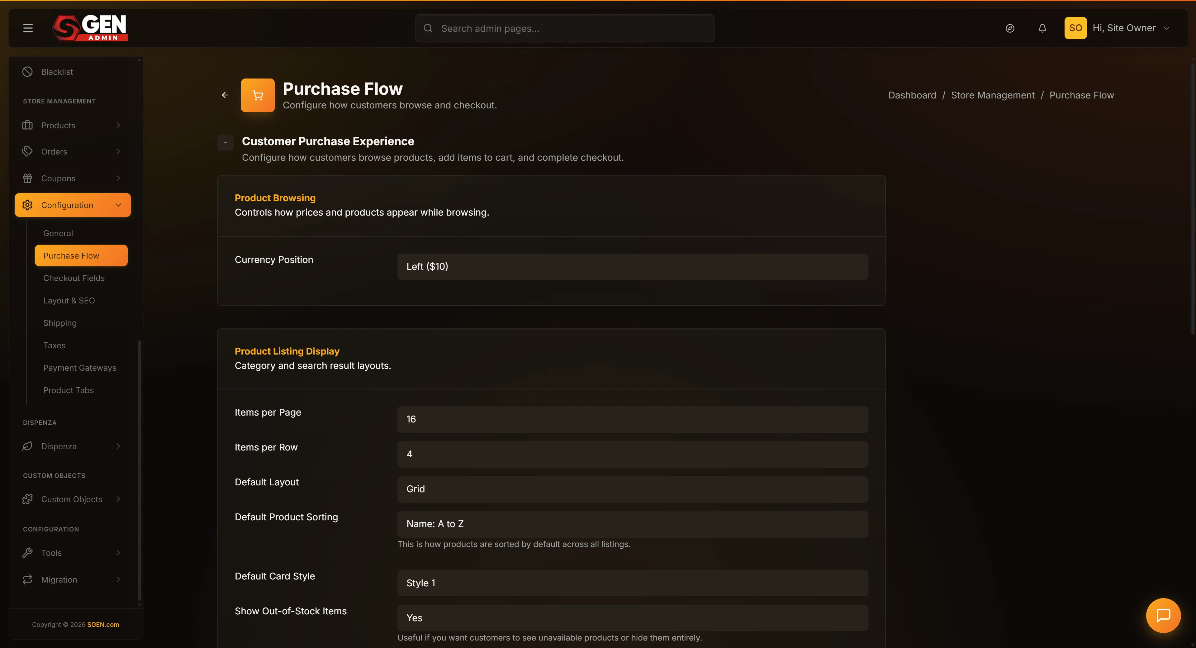
From the admin sidebar, click Settings, then Store Management, then the Purchase Flow tab.
2. Scroll to the Product Listing Display panel
Find the panel labeled Product Listing Display. It is the second panel from the top.
3. Change Listing Layout to List
Find the Listing Layout dropdown. Click it. Select List from the menu.
If you also want a different number of items per page on the list view (lists tend to look better with fewer items because each row is taller), update Items Per Page in the same panel.
4. Save Changes
Scroll to the bottom of the page and click Save Changes. The form refreshes with your new state.
5. Verify on the public listing page
Open your storefront in another tab. Navigate to a category or shop page. Confirm the layout is now list-style — one product per row with the image on one side and description on the other.
If the layout still looks like a grid, refresh the page in a private browsing window — sometimes browser caching keeps the old layout for a few minutes.
Steps — switch the After Add to Cart behavior from drawer to toast
1. Open the Purchase Flow tab and scroll to Cart Behavior
Open Settings → Store Management → Purchase Flow. Find the Cart Behavior panel near the bottom.
2. Change After Add to Cart
Find the After Add to Cart dropdown. Click it. Select Toast notification from the menu.
3. Save Changes and verify
Scroll to the bottom and click Save Changes. Open your storefront, click Add to Cart on any product, and confirm a small toast notification appears in the corner of the screen instead of the previous drawer or popup.
If you do not see the toast, check that your theme supports the toast option — some themes only implement a subset of the four after-add-to-cart options. If yours does not, fall back to drawer or popup.
What success looks like
After you save the Purchase Flow configuration, the changes apply on the very next page render of the storefront. Shoppers who load the home page, a category page, a product page, or the cart from that point onward see your new settings.
You should walk through your shop once after every change. Open the storefront in another tab, browse to a category, click a product, add it to cart, and proceed to checkout. Confirm each step matches what you intended.
The page should also show a green confirmation flash at the top after every save with the heading "Ecommerce configuration has been successfully updated."
A well-tuned purchase flow is one where shoppers move from arrival to checkout without any moment of confusion. The listing density feels right. The product page reveals enough but not too much. Add to Cart triggers a feedback that matches the shopper's expectation. The cart icon does what shoppers think it should do. The coupon field appears or stays hidden according to your promotional posture. The order-notes field gives shoppers a voice or stays out of the way.
What to do if it does not work
If your changes save but the storefront still shows the old behavior, the most common cause is browser caching. Open the storefront in a private or incognito window and you should see the fresh experience.
If you switched After Add to Cart to Toast and shoppers still see a drawer, check that your theme supports the toast option. Some custom themes only implement two or three of the four options. If yours does not, switch back to drawer and ask the theme team to add toast support.
If you changed Listing Layout to List but the listing page still shows a grid, your theme may be hard-coded to grid. Some custom themes ignore the global Listing Layout setting because they have their own per-page layout choice. Test in a private window first; if the issue persists, the theme template needs updating.
If shoppers report that the cart drawer feels janky or slow, that is usually not a setting issue but a JavaScript or theme issue. Open the browser developer console while clicking Add to Cart. Any errors there are worth reporting to whoever maintains your theme.
If you hid the coupon-code field but shoppers can still apply coupons via URL, that is by design — URL-based coupons keep working even when the manual entry field is hidden. If you want to fully turn off all coupon application, you also need to disable any active coupons in the Coupons feature.
If shoppers report they could not leave order notes even though the field is enabled, double-check that you saved the change. A slow connection can silently revert a save. Re-tick Show Order Notes, save again, and try in a private window.
If you turned off Show Out-of-Stock Products and a few products still show up despite being out of stock, those products may have stock tracking turned off entirely. The setting only hides products whose stock has reached zero through the stock-tracking system. If you have a product with stock tracking off, it never reaches zero in the system and the hide rule never fires.
If a customer asks about Currency Position behaving strangely, walk through the price as it appears in their location and on their device. Some shoppers use browser extensions that auto-convert currency or modify the display; that is outside your shop's control.
If multiple admins are editing the Purchase Flow tab at the same time, the last save wins. There is no merge or conflict warning. Coordinate with your team if more than one person is configuring this.
If a setting on this page seems to have no effect, check whether your theme supports it. Older themes built before a specific setting existed may ignore it. The theme team can patch the theme to honor the new setting.
Examples
Example 1: Your Store tunes for browsing-then-buying
A US apparel shop: Currency Position left ($10), Items Per Page 16, Items Per Row 4, Listing Layout grid, Default Sort best selling (flagship products surface first), Card Style 2 (larger photo), Stock Count on, Related Products on, After Add to Cart drawer, Cart Icon drawer (consistent with Add to Cart), Coupon Entry on, Order Notes on. The drawer-first flow lets shoppers add multiple items before committing to the cart.
Example 2: Your Store Studio sells digital prints with minimal flow
A digital-downloads shop: Items Per Page 24, Items Per Row 6 (dense grid for visual browsing), Stock Count off (unlimited digital stock), Related Products off (small catalog), After Add to Cart redirect, Cart Icon redirect (one-item checkout flow), Coupon Entry off (fixed-price model), Order Notes off (nothing to fulfill).
Example 3: Your Store Wholesale localizes for European markets
A wholesale store serving France, Germany, and the Netherlands: Currency Position right (10$) so prices render as "18,50 €", Items Per Page 24, Items Per Row 6, Default Sort Title A–Z (wholesale buyers know what they want and expect alphabetical order). One setting change; every price on the storefront reads correctly for European buyers.
Example 4: Your Store hides coupons during a clearance sale
Sitewide 30% clearance sale — no coupon stacking wanted. One change: Show Coupon Code Entry → No. The field disappears from cart and checkout. After the sale, flip it back to Yes. Thirty-second change; margin protected for the entire sale period.
Example 5: Your Store Boutique runs a high-touch product page
Artisan jewelry — one-of-a-kind pieces: Items Per Page 12, Items Per Row 3 (curated feel), Listing Layout list (room for a tagline per item), Stock Count on ("Only 1 available" drives urgency), Related Products off (every piece is unique), After Add to Cart popup (pause before committing), Cart Icon drawer (peek without losing context), Order Notes on (gift-wrap and engraving requests).
Example 6: Your Store debugs a checkout drop-off
Add to Cart events are healthy but checkout completion is low. Diagnosis: After Add to Cart is set to redirect — shoppers hit the full cart page after every single add, which interrupts browsing. Fix: switch After Add to Cart to drawer, keep Cart Icon Behavior at redirect. Shoppers now add multiple items freely; the cart-icon click is when they commit. A single setting flip; no development effort.
Next steps
- See the Store Basics doc to set Store Status, Origin, and Units.
- See the Checkout Fields doc to choose which billing fields appear at checkout.
- See the Payment Gateways doc to connect Stripe or PayPal.
- See the Shipping Methods doc to configure how shoppers pay for delivery.