
How to view your analytics reports
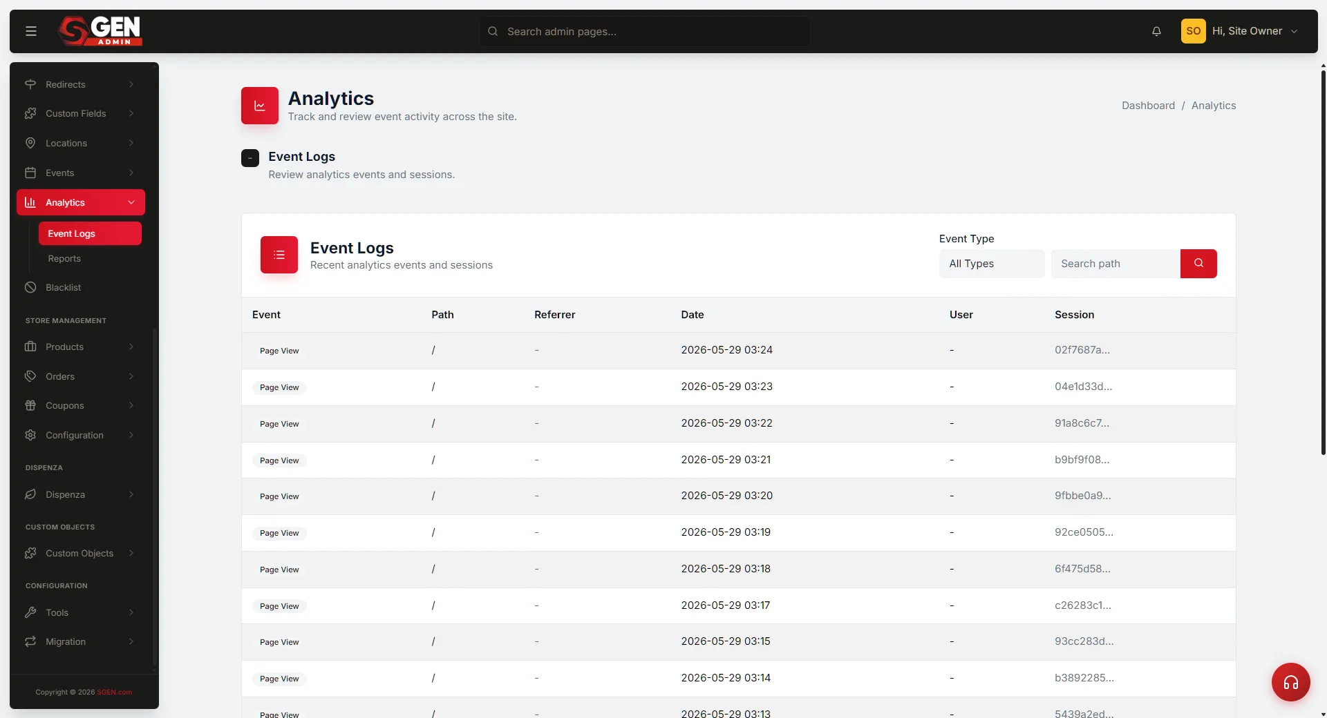 Reports page — three filters (Event Type, Top Paths, Date Range) above the doughnut + trend-line charts" loading="lazy" style="width:100%;max-width:900px;height:auto;border-radius:8px;border:1px solid #e5e7eb;display:block;margin:12px 0">
⏱ ~2 min answer below · full guide ≈ 8 min · skim the bold lead-ins to move faster.
In short. In your admin sidebar, click Analytics, then Reports. Three filters sit above two charts — Event Type (default: page_view), Top Paths (default: Top 10), and Date Range (default: last 30 days). Change any filter and both charts redraw instantly: a doughnut on the left shows your most-visited pages by share, a trend line on the right shows each page over time. The page is read-only — nothing you do here changes your site. Start with a clear question ("which pages got the most traffic last month?"), pick a date range that fits it, and read the doughnut for the headline and the trend line for the shape.
On this page: What this is for · Good use cases · Steps · What success looks like · Troubleshooting · Examples
How to view your analytics reports
What is this for?
The Analytics Reports page is your visual dashboard for site traffic and behavior data.
Go here when you need a chart to answer a question — "which pages were most visited last month?" or "is traffic to our spring promotion picking up?" Reports lives one click deeper than the Analytics overview: the overview shows headline numbers (today's visits, this month's totals); Reports lets you examine those numbers over time, drill into specific event types, and set any date range you need.
Two charts side by side:
- Doughnut (left) — traffic distributed across your top pages. The center label shows the total event count so you see absolute numbers alongside percentages.
- Trend line (right) — each top page plotted as its own line over time, so you can see at a glance whether a page is gaining, holding, or fading.
Three filters above the charts:
- Event Type — defaults to
page_view; switch toproduct_view,blog_post_view, orevent_viewto focus on a content type. - Top Paths — Top 5 / Top 10 / Top 50 / View all. Controls how many lines and slices appear.
- Date Range ��� presets (today, last 7 days, last month, etc.) plus a custom calendar. Charts redraw as soon as you confirm the date picker — there is no Apply button on the filter bar itself.
Data source: first-party only — events that fired on your SGEN site. Numbers won't match third-party tools exactly; expect the same ballpark, not the same digit.
Good use cases
- Monthly traffic review. Set Date Range → Last Month, screenshot both charts, paste into your monthly report. Doughnut = where visitors went; trend line = how each top page changed.
- Spotting growth or decay. Set 90 days; upward-sloping lines are gaining, flat lines are steady, downward lines need a look.
- Validating a campaign. Set the date range to the campaign window and look for the campaign URL in the doughnut.
- Diagnosing a spike or drop. Narrow to a single day and read the doughnut to identify which page caused the move.
- Editorial planning. Set 90 days + View all; walk the doughnut from largest to smallest to decide what to promote, amplify, or refresh.
- Confirming normal quiet periods. Distinguishes genuine low-traffic days from a tracking break or deployment problem.
What NOT to use this for
- Real-time monitoring. Reports loads once on page open — it doesn't auto-refresh. Use a third-party real-time tool for live monitoring.
- Funnel or conversion analysis. Reports counts individual events; it doesn't link a visitor's path across multiple steps.
- User-level or session analytics. All data is aggregated — no per-visitor, per-session, or cohort view.
- A/B test reporting. Use a dedicated A/B tool to compare variant performance.
- Heatmaps or scrollmaps. Reports counts page views; it doesn't capture on-page behavior.
- Revenue or business KPIs. Reports covers traffic, not conversion rate, average order value, or any other business metric.
How this connects to other features
- Analytics overview — one click up from Reports. Visit the overview for a daily pulse check; open Reports when you need to dig into a date range or event type.
- SEO settings — the doughnut reveals which pages search sends traffic to. Use that to prioritize SEO tuning on your highest-traffic pages.
- Redirects — when you redirect
/old-urlto/new-url, the source stops appearing in Reports and the destination gets a corresponding bump. If numbers look strange after a site reorganization, check your redirects first. - Settings → Maintenance Mode — while maintenance mode is on, most paths show a corresponding dip in Reports.
Before you start
- Have a question. Without a specific question, you can spend an hour without learning anything actionable.
- Know your date range. Campaign-impact questions usually want the campaign window plus comparison before/after. Trend questions usually want 90 days or more.
- Know the difference between event types.
page_viewcounts visits to any page.product_view,blog_post_view, andevent_viewfire only on those specific page types. - Top Paths changes the visual story. Top 5 is great for an executive summary. Top 10 is the default. Top 50 or View all is useful when hunting for a specific page.
- The page is read-only. Nothing you do on Reports affects your live site.
Where to go
In your admin sidebar, click Analytics. The overview loads. Then click Reports in the sub-navigation (or the "View Reports" button if your overview shows one).
Page layout: filter bar at the top (Event Type, Top Paths, Date Range), then a two-pane chart layout — doughnut left, trend line right, stat block below each chart.
If you see "No events yet for this period," switch Event Type to page_view and broaden Date Range to Last 90 Days. Still nothing? Check Settings → Tracking & Consent or contact support.
Steps — Run a typical "what happened this month?" report
1. Open the Reports page
In your admin sidebar, click Analytics. The overview opens; click Reports in the sub-navigation. The page loads with defaults: Event Type page_view, Top Paths Top 10, Date Range last 30 days. Both charts render after a brief loading indicator.
2. Set the date range
Click the Date Range field. A calendar opens with presets on the left (Today, Yesterday, Last 7 Days, Last 30 Days, This Month, Last Month, Custom Range).
For a "what happened this month?" report, click This Month. The calendar highlights the first of the current month through today. Click Apply in the bottom-right. Both charts redraw — Apply on the date picker is the only Apply you click.
3. Set Top Paths
Click the Top Paths dropdown and choose:
- Top 5 — executive summary, slide-ready.
- Top 10 — the default; a good general-purpose view.
- Top 50 — when hunting for a specific page in the long tail.
- View all — when you have a small site or want to scan everything.
4. Optionally change Event Type
Click Event Type and pick a content type if you want to focus (product views, blog views, event views). For most "what happened?" reports, leave it on page_view.
5. Read the doughnut chart
Each slice is one path. Hover to see the path name, event count, and percentage. The center label shows total events for the window. One dominant slice means a single tentpole page; even slices mean well-distributed traffic.
6. Read the trend line chart
Each top path is its own line. X-axis = date, Y-axis = events. Hover for exact values.
What to look for:
- Lines tilting upward — pages gaining traction; worth promoting or building around.
- Flat lines — steady performers.
- Lines tilting downward — pages going stale or deliberately de-emphasized.
- Sudden spikes — usually a marketing event, viral mention, or algorithm change.
- Sudden cliffs — almost always a problem: maintenance mode on, a misfiring redirect, or a CDN outage.
7. Save your findings
Reports doesn't save filter selections between visits and has no built-in PDF export. Screenshot both charts, paste into a doc, and add a one-sentence caption for context.
What success looks like
A successful Reports session ends with a concrete answer. For example:
- "Last month our top page was
/spring-blendwith 8,754 views — up 22% from the previous month." - "Traffic to the blog peaked on April 14 (newsletter send date) and has held about 30% above baseline since."
- "The campaign URL got 1,247 visits during the campaign window — roughly what we projected."
If you finish without a concrete answer: either you didn't have a specific question going in, or the data isn't there yet (new page — wait a week and try again).
What to do if it does not work
- "No events yet for this period." Switch Event Type to
page_viewand broaden Date Range to Last 90 Days. Still nothing? Check Settings → Tracking & Consent or contact support. - Doughnut shows but trend line is blank. Reload the page. If that doesn't help, try a narrower date range.
- Numbers don't match Google Analytics / Plausible. They won't match exactly — different tools filter differently. Expect the same ballpark (within 10–20%). A factor-of-2 gap usually means one tool is counting bots and the other isn't.
- A page I know is getting traffic isn't in the doughnut. It's probably outside the Top N. Switch Top Paths to "View all" and use browser Find to search for the path.
- Date range picker won't let me select a date. Hard-refresh (Ctrl+Shift+R / Cmd+Shift+R) and try again.
- Numbers seem too low. Some sites exclude admin traffic from tracking. Log out, visit a few pages as a regular visitor, log back in, and reload Reports.
- Numbers seem too high. Bot traffic is likely being counted. SGEN's first-party counter doesn't filter bots aggressively — compare to a third-party tool to see the bot-filtered number.
- Page loads slowly or seems stuck. Large date ranges on busy sites can take 10–30 seconds. Wait a full 30 seconds before reloading. If still stuck, narrow the date range.
If none of the above resolves the issue, contact support with: (1) a screenshot including the URL bar, (2) your filter values, and (3) the date and approximate time you saw the problem.
Example 1: Reviewing last month's traffic
The marketing manager opens Reports on the first business day of May. They set Date Range → Last Month and Apply. The two charts redraw to show April 1–30.
The doughnut center label reads 24,318 events. The largest slice is /spring-blend at 36% — the new spring landing page launched April 1. The trend line shows that page starting at zero on April 1 and ramping steadily, with a steep rise around April 14 (the newsletter send date).
The manager screenshots both charts, drops them into a one-page "April Traffic Recap," and writes: "Spring blend is now our top page at 36% of all April traffic. The April 14 newsletter drove a step-change. Recommend doubling down in May." Total time: 8 minutes.
Example 2: Monthly snapshot discipline
On the first business day of each month, set Date Range → Last 30 Days and screenshot both charts. Save as YYYY-MM-DD-reports.png in a shared folder.
After six months, those snapshots tell a richer story than any single one — which pages are seasonal, which are growing, which have gone stale.
Next steps
- How to read your Analytics overview dashboard — headline numbers page. Visit daily for a pulse check; open Reports when you need to dig in.
- How to track custom events with Custom Codes — for capturing events beyond the built-in page_view / product_view / blog_post_view / event_view set.
- How to set up your SEO settings — pair high-traffic pages (identified in Reports) with carefully-tuned SEO.
- How to manage Redirects — when traffic numbers look strange after a site reorganization, check your redirects first.