
Visualize traffic with Analytics Reports
⏱ 90-second answer below · full page ≈ 8 min · skim the bold lead-ins to move faster.
In short. Go to Analytics → Reports. Pick an event type (Page View is the default), a top-N cap, and a date range — each filter auto-submits and redraws the charts instantly. The doughnut on the left shows your most-visited pages by share; the line chart on the right shows each of those pages trending day by day. Use it for weekly traffic reviews, launch-day verification, broken-link cleanup, and shareable campaign snapshots — every filter you set is reflected in the URL, so the view is bookmarkable and shareable verbatim. The page is read-only; nothing you do here changes your site.
On this page: What this is for · Good use cases · Steps · What success looks like · Troubleshooting · Chart shape guide
What is this for?
Analytics Reports is the visual summary of your site's traffic — a doughnut chart of your most-visited pages, a line chart showing how those pages trend day by day, and two stat tiles at the top. It answers questions like "what pages drove traffic last week?" and "did our launch spike the way we hoped?".
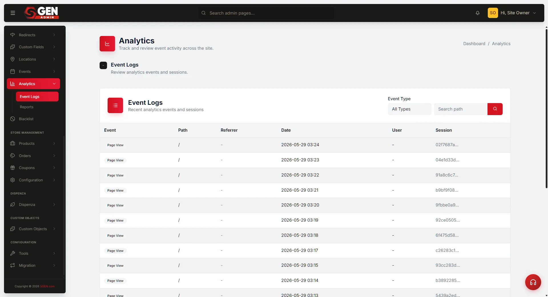
It turns the raw events table behind Event Logs into charts you can scan. You pick a date range, an event type, and a top-N cap; SGEN computes the aggregates and renders them. Everything is read-only — your filter choices are captured in the URL so you can bookmark or share the view verbatim.
The two summary tiles give you the headline before you look at the charts. After 30 days of traffic, they might read:
Total Events is the headline — every event across the top-N paths for your selected filter. Top Paths is how many distinct paths SGEN is charting (capped by your top-N selector). All Paths is the long-tail count; anything between that number and Top Paths is outside the doughnut.
The whole page sits in a single screen — toolbar at the top, summary tiles in the middle, both charts side by side at the bottom:
Preview: Reports dashboard — a screenshot of this screen will be added here.
The toolbar sets the scope. The tiles answer the headline. The two charts show the shape — share-by-page on the left, day-by-day on the right.
Good use cases
Weekly traffic review. Every Monday morning, open Reports with the last 7 days selected. The doughnut shows which pages pulled weight; the line chart shows whether the week trended up or down. Five-second answer.
Launch-day verification. Narrow the date range to bracket a launch. The line chart's per-day shape tells you whether traffic arrived as expected — a flat baseline on launch day usually means the link sharing did not happen, or did not work.
Broken-link cleanup. Switch Event Type to the broken-link option once a month. The doughnut becomes a heat map of bad paths ordered by frequency. Pair with Redirects to add a rule for the top offenders.
Stakeholder updates. Set your filters, copy the URL, paste it into a reply. The recipient lands on the same view you are looking at — no export needed.
How this connects to other features
- Event Logs — Reports is the visualization of the same data. When a chart makes you curious about a specific path or date, jump to Event Logs and read the individual rows.
- Redirects — when Reports surfaces a broken-link path climbing in the line chart, open Redirects and add a rule to catch it.
- Google Integration and Custom Codes — for GA4, Google Tag Manager, and Meta Pixel. Native Analytics Reports is a separate, server-side system. Most teams use both: third-party tools for cross-device user journeys, native Reports for fast in-admin answers.
- Tracking and Consent — governs third-party trackers. It does not gate native Analytics — your own server always sees its own page requests.
Before you start
- Reports shows SGEN's native tracker, not GA4 or Pixel. If your marketing team reports from Google Analytics, those numbers will not match Reports one-for-one.
- The default date range is the last 30 days. It drifts: bookmark the default view and come back a week later and the range has moved. For a stable comparison, pick an explicit date range.
- Default Top Paths is 10. Anything below your top 10 is pooled out of the line chart. Use View all or Event Logs for the long tail.
- You must be signed in as an Administrator. Reports lives under the admin; viewers cannot reach it.
How to use Analytics Reports
Where to go
- Open the left navigation.
- Click Analytics, then the Reports tab. You land on the Reports dashboard.
Steps
1. Pick an event type
The Event Type filter defaults to All Types. Open the dropdown and pick one — Page View, broken-link tracking, Product View, Add To Cart, Checkout Started, or Purchase. The form auto-submits the moment you change it; there is no separate Apply button. Both charts redraw and the URL updates so the filter is shareable.
For a content-heavy site, Page View is the everyday default. Switch to the broken-link event type when you want a heat map of bad paths, or to one of the four ecommerce events when reviewing checkout funnels.
2. Pick a top-N cap
The Top Paths filter caps how many paths get their own doughnut slice and line series. Choices: Top 5, Top 10 (default), Top 50, View all. Same auto-submit behavior.
Use Top 5 for a clean answer to "what are the headline pages this week?". Use Top 50 or View all when investigating the long tail. On high-traffic sites, View all can produce a very busy line chart — switch to Event Logs for full-resolution data instead.
3. Pick a date range
The Date Range field opens a calendar picker with preset shortcuts (last 7 days, last 30 days, this month, last month, this year) and a custom start-and-end pair. Click Apply on the picker to commit. Closing the calendar without clicking Apply throws the change away.
4. Read the result
Both charts refresh in place. The browser URL reflects all three filters at once — bookmark or copy the URL and the view is shareable verbatim.
What success looks like
- The Reports page loads; the Total Events tile fills in, the doughnut animates from the center outward, and the line chart fades up from the baseline.
- Changing a filter redraws both charts and updates both summary tiles within a beat.
- Hovering a doughnut slice shows a tooltip with the path, event count, and percentage. Hovering a point on the line chart shows the exact event count for that path on that day.
- The Total Events tile equals the sum of the doughnut slices for the same range (or the top-N subset if your cap is below the total path count).
- A flat zero series for an entire date range means that path saw no events in the window — the zero-fill is intentional and keeps the date axis continuous.
Examples
Example 1: See your top 5 pages last week. Pick Top 5 and move the date-range picker to the last 7 days. The doughnut shrinks to 5 slices; the line chart shows 5 series; the Total Events tile updates.
For an Apr 14 — Apr 21 week with Page View and Top 5, the breakdown looks like this panel — the homepage carries the bulk, and a product page is climbing on the back of a newsletter:
Example 2: Check whether launch day spiked. Narrow the date range to bracket the launch — a day or two before, to a day or two after. The line chart fills in one series per top page over the window, with the y-axis showing events per day. A launch spike is usually unmissable: one or more series jumps several times higher on launch day than on neighboring days. A flat baseline on launch day usually means the link sharing did not happen, or did not work.
Example 3: Bookmark a campaign window. Every filter is reflected in the URL, so the view is bookmarkable and shareable:
Empty range. If you tighten the date range to a quiet window or pick an event type that did not fire, the chart frame still loads and tells you so:
Tips for getting more out of Reports
- Pick an explicit date range, not the rolling default. "Last 30 days" drifts every day. An explicit range stays comparable; a rolling default does not.
- Compare like-for-like windows. When checking lift from a launch, compare the same number of days immediately before and after.
- Glance at Reports before opening Event Logs. Thirty seconds on the doughnut tells you which path deserves attention before you drill into the row level.
- Tag campaign links. If all paid traffic lands on the homepage, those visits dilute the Top Paths read. Send paid traffic to a dedicated path so the campaign earns its own slice.
- Bookmark the view you reopen weekly. A calendar reminder with the bookmarked URL takes the manual step out of the weekly review.
- Treat missing paths as signal, not failure. A path outside the top-N cap does not appear — switch to View all or Event Logs before assuming the page is dead.
- Role shortcuts: marketing reads the doughnut first (channel health) then the line chart (campaign lift); engineers check broken-link tracking weekly and use Redirects to drain it; a solo site owner glances at both charts weekly and checks broken-link paths once a month.
What the chart shapes mean
The flat-line cliff. Every series goes flat on the same day. Almost always a site issue — the page stopped rendering, a CDN rule blocked the path, or the tracker broke. Confirm the page loads in a private window.
The single-page spike. One series jumps several times higher for a single day, then drops. Usually a press mention, a podcast feature, or a forum thread. Worth tracing; if it recurs, add UTM tagging.
The slow climb. A path drifts upward over weeks — typical of organic search ranking on a new post. Compare months, not days; weekly noise hides the trend.
The Monday-morning reset. Most sites tick up Monday, peak Tuesday–Thursday, dip Saturday–Sunday. Reading the Friday–Monday dip as a problem when it is the steady-state pattern is the easiest analytics mistake to make.
The new-path surprise. A path appears in the doughnut you have never seen — often a typo URL, a syndication path, or a feed reader. Click into Event Logs filtered to that path; usually one row tells the story.
The climbing broken-link path. A path on the doughnut climbs steadily in broken-link view. Open Redirects, add a rule, and watch the series go flat in next week's report.
What NOT to use this for
- Do not assume the line chart shows all traffic. It only shows the top-N paths for the selected range. Long-tail pages do not appear as their own series — switch to Event Logs for the full-resolution view.
- Do not filter All Types when analyzing product-specific behavior. A product page that gets both page-view and product-view events is summed into the same series. Filter by a single event type for apples-to-apples comparison.
- Do not bookmark the default view for team sharing. The default date range drifts. Set an explicit date range and click Apply before copying the URL.
- Do not compare two consecutive days on a low-traffic site. A site averaging 20 visits a day will vary wildly day-over-day on noise alone. Use weekly or monthly windows for low-traffic trends.
- Do not screenshot Reports as a definitive record. The numbers are accurate at the moment of the screenshot, but older events may roll off retention windows. Export from Event Logs when you need a frozen record.
What to do if it does not work
- Charts are empty. The message "No events yet for this period." appears when the filter resolves to zero rows. Widen the date range or clear the Event Type filter.
- Doughnut center does not match Event Logs. Expected — the doughnut only counts your top-N paths; Event Logs counts every event.
- One path dominates the doughnut. Usually the homepage. Set a narrower Event Type, or use Event Logs to see the long tail.
- A flat zero series for a path. That path had events earlier in the range but zero in the charted window. The zero-fill is intentional.
- Date-range picker snaps back. Pick the dates, then click Apply on the picker. Closing without Apply throws the change away.
- Charts stay blank after load. Close and reopen the page, confirm you are on a modern browser, and check that any ad-blocker is not blocking scripts on the admin.
- Numbers shifted overnight. A teammate may have cleared the events table, or the retention window rolled some events off. Cross-check Event Logs row counts before assuming a counting bug.