
Preview your site on mobile
⏱ ~4 min read · step through all six breakpoints, fix issues in SG-Builder, confirm clean, publish.
In short. SGEN's breakpoint switcher lets you resize the editor canvas to six standard widths — 1920, 1199, 991, 767, 575, and 480 px — without leaving the admin. Step down from 767 to 480, note every overflow or size issue, fix per-device styles in SG-Builder, then run a final sweep before you hit Publish. The whole check adds about five minutes to a page publish and catches broken layouts before any visitor sees them.
On this page: Breakpoint widths · When and when not to use it · Before you start · Where to open it · Steps · Success criteria · Troubleshooting · Habits
SGEN includes a built-in mobile preview inside the page editor and the blog editor. You see the layout adjust in real time as you switch widths. The preview is a browser-based approximation of mobile widths — not a real-device test — but it is fast, accurate enough to catch layout problems, and built into the same interface where you make the fixes.
The six breakpoints
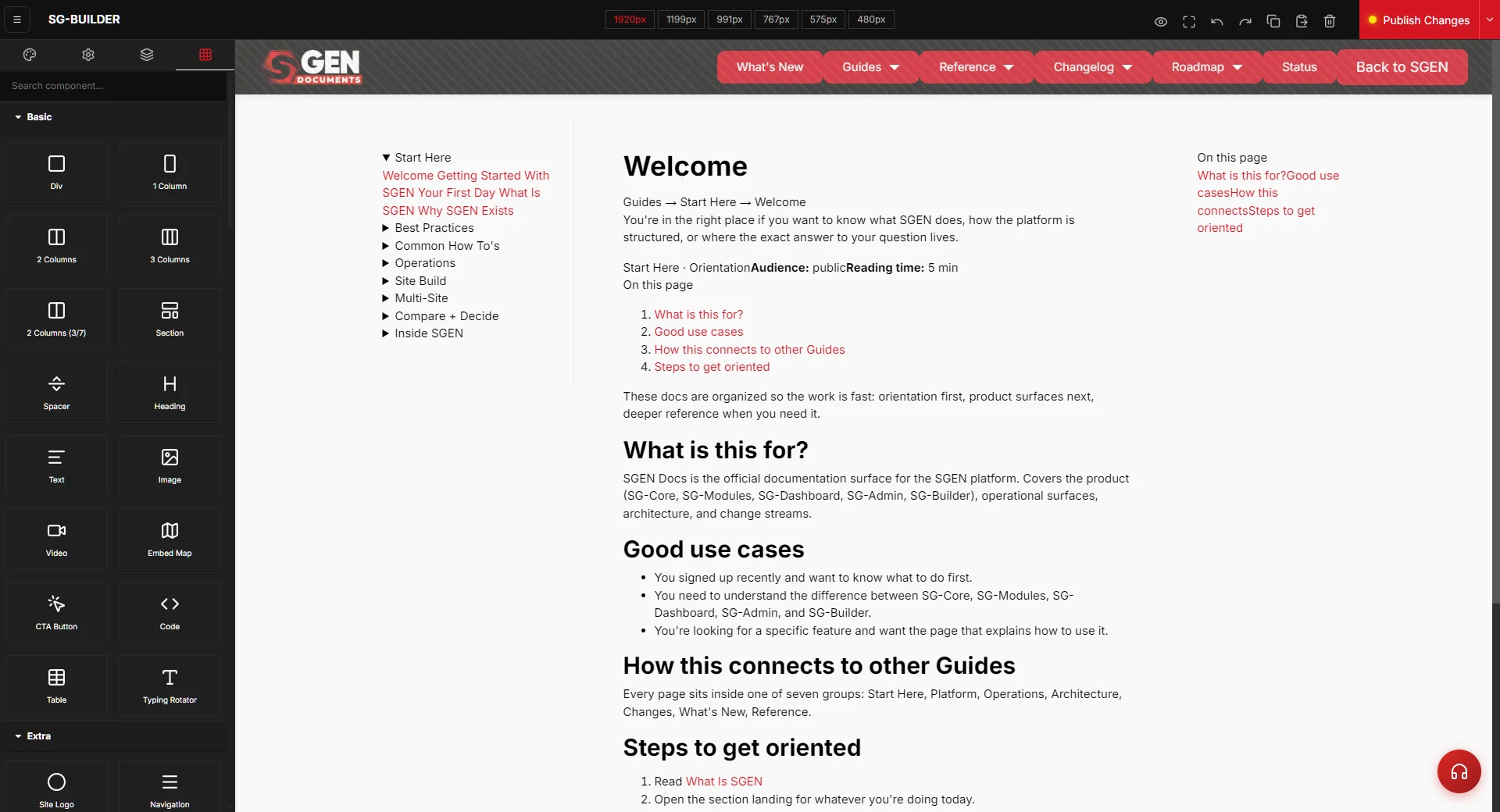
The breakpoint switcher sits in the SG-Builder toolbar as a row of width buttons. Clicking a width immediately resizes the canvas.
| Width | Label | What it covers |
|---|---|---|
| 1920 px | Desktop XL | Large monitor / widescreen |
| 1199 px | Desktop | Standard laptop / desktop |
| 991 px | Tablet landscape | iPad landscape, large Android tablet |
| 767 px | Tablet portrait | iPad portrait, medium tablet |
| 575 px | Mobile large | Large-screen phones (iPhone Pro Max) |
| 480 px | Mobile small | Standard phones, narrow screens |
The widths that matter most for catching problems are 767, 575, and 480. Desktop is what most editors work in; mobile is where most visitors arrive.
Use cases and limits
Use it for:
| Scenario | Why it matters |
|---|---|
| Pre-publish check on any new page | Catches overflow and broken sections before any visitor sees them |
| Campaign landing page QA | Dense image/offer/timer layouts break at 480 px without a check |
| Post-edit verification | A changed hero image or new headline can introduce mobile overflow on a previously clean page |
| Template review after a global change | One bad padding rule in a shared header can break every page that uses it |
Do not use it for:
| Not a substitute for | Reason |
|---|---|
| Real-device testing | The preview simulates viewport widths — it does not replicate touch behavior, device font rendering, or OS-level zoom. For high-stakes pages (homepage, checkout, campaign), supplement with a real device test. |
| Accessibility auditing | The switcher spots visual layout problems only — not contrast ratios, screen-reader compatibility, or ARIA. Use Lighthouse or axe DevTools for that. |
| Performance testing | A page can look correct at 480 px and still load in eight seconds on mobile. Use PageSpeed Insights for performance validation. |
| Cross-browser compatibility | The preview renders in your desktop browser. Safari on iOS can differ, particularly for CSS grid and flexbox edge cases. |
Before you start
- Save the page first. The breakpoint preview reflects the last saved state. Unsaved edits will not appear.
- Know what "correct" looks like. Have a design mockup or screenshot open alongside the preview. You cannot spot a broken layout without a reference.
- Confirm edit access. If the page uses SG-Builder components, you need SG-Builder editor access to apply fixes.
Where to go
For SG-Builder pages: Navigate to Pages, find the page, click Edit, then click SG-Builder. The breakpoint switcher appears in the top toolbar as width labels (1920 / 1199 / 991 / 767 / 575 / 480). The editor loads at desktop width by default.
For standard pages (not SG-Builder): Navigate to Pages, click Edit, then click Preview (top right or below the page title). The preview opens in a new tab. Use browser DevTools (F12 → device toolbar) to simulate mobile widths.
For blog posts: Navigate to Blog, click Edit, then click the Preview link. Use browser DevTools on that preview tab to check mobile widths, or reference the breakpoint table above.
Steps — Preview your site on mobile and fix what you find
Follow these steps in order. Do not skip the 480 px step — it is the smallest width and the most likely to reveal overflow and wrapping problems.
1. Open the page in the SG-Builder editor
Navigate to Pages in the left sidebar. Find the page, click Edit, then click SG-Builder to enter the visual editor. If the page was built with the standard rich text editor, use the Preview button instead and follow the browser DevTools path above.
The editor loads at desktop width (1920 or 1199 px) by default.
2. Open the breakpoint switcher and select the first mobile width
Locate the breakpoint switcher in the top toolbar: 1920 / 1199 / 991 / 767 / 575 / 480. Click 767 to switch the canvas to tablet portrait width. The layout adjusts immediately. Watch for:
- Text that was in two columns shifting to a single column
- Images that reflow or resize
- Navigation menus collapsing to a hamburger icon
- Any element that disappears entirely
Do not make fixes yet — complete the full sweep first so you have a complete issue list before editing.
3. Step through each breakpoint and log issues
Work through 767 → 575 → 480. For each breakpoint, check:
Horizontal scrollbars. A horizontal scrollbar means something is overflowing — an image, a fixed-width container, or a wide table wider than the viewport. Note which section.
Text overflow. Long words, unbroken URLs, or text in fixed-width containers can overflow on narrow screens. Look for text that is clipped or overlaps another element.
Images too wide. Images without max-width constraints expand to natural pixel width on narrow viewports. A 1200 px image on a 480 px canvas causes horizontal scroll.
Tap targets. Buttons and links should be at least 44 px in height and width. If a button looks visually small at 480 px, note it.
Font size. Body text below 14 px is difficult to read without zooming. Headlines below 20 px lose visual hierarchy.
Navigation. Confirm the menu collapses correctly at 767 px and remains usable at 480 px.
Hero sections. Full-width hero images and text blocks are common problem areas — the image may crop unexpectedly or the CTA button may not render correctly.
Log your issues: breakpoint, element, problem description.
4. Fix per-device styles in SG-Builder
Stay in the SG-Builder editor. Click the breakpoint where the first problem occurs, then select the component that needs fixing. Styles set at a breakpoint apply only to that breakpoint — fixing mobile does not affect desktop.
Common fixes:
Image too wide. Select the image component → set Max width to 100% at the mobile breakpoint.
Text overflowing its container. Check if a fixed pixel width is set on the component or its parent. Change fixed widths to percentages (100% for full-width text blocks) at the mobile breakpoint.
Button too small to tap. Increase padding top and bottom (aim for at least 12 px top/bottom so total button height clears 44 px). Increase font size if below 14 px.
Column layout not stacking. If a multi-column layout is not collapsing at 767 px or below, set flex direction to column or grid columns to 1 at the mobile breakpoint.
Font too small. Increase font size at the mobile breakpoint. Body text at 15-16 px is a reliable starting point. Keep headlines above 22 px.
After each fix, save first. Then confirm the fix at the affected breakpoint, and also quickly check the breakpoints above to confirm the desktop layout was not affected.
5. Save and re-preview after fixes
After applying fixes, save the page. Return to the breakpoint where the problem was and confirm the fix worked. Then step through all six breakpoints again — style changes in SG-Builder can have cascading effects.
If the fix did not work:
- Confirm you were at the correct breakpoint when you applied the change. Styles set at one breakpoint do not automatically apply to narrower ones.
- Check whether the component has a fixed width set in Custom CSS with
!important— that will override SG-Builder per-device styles. - Check whether the parent container has a fixed width constraining the child component.
Repeat the fix → save → re-preview cycle until all six breakpoints show a clean layout.
6. Run a final six-breakpoint sweep and confirm clean
Before publishing, do one complete sweep: 1920 → 1199 → 991 → 767 → 575 → 480. Check four criteria:
No horizontal scrollbars. Scroll slowly down the page at each mobile breakpoint. If a horizontal scrollbar appears, there is still an overflow issue.
All text is readable without zooming. At 480 px, the smallest text should be comfortably readable. If you have to mentally squint, a real visitor will pinch-zoom — and that is a broken experience.
All tap targets are large enough. Buttons, links, navigation items, and form fields should all visually occupy at least 44 px of height.
No content disappears unintentionally. If a CTA button, key headline, or form has disappeared at a mobile breakpoint, that is a bug.
When the six-breakpoint sweep is clean on all four criteria, the page is ready to publish.
7. Publish when the layout is clean
Click Publish in the top toolbar. After publishing, open the live URL on your phone and scroll top to bottom. It takes thirty seconds and catches any discrepancy between the preview and the live render. For high-stakes pages (homepage, campaign, product launch), this real-device scroll is non-optional.
What success looks like
The page is ready to publish when:
- All six breakpoints checked: 1920, 1199, 991, 767, 575, 480.
- No horizontal scrollbar appears at any breakpoint while scrolling the full page.
- All text is readable at 480 px without pinch-zoom.
- All buttons, links, and form fields are visually at least 44 px in height.
- Images are constrained to their containers and do not overflow at any mobile breakpoint.
- Navigation collapses correctly at 767 px and remains usable at 480 px.
- No content that should be visible at mobile has disappeared unintentionally.
- Per-device style fixes are applied at the correct breakpoint; desktop layout is unaffected.
- The final six-breakpoint sweep passes all four criteria.
The next step is the broader publishing workflow: SEO metadata check, Open Graph image, internal link review. Those are covered in the Pages publishing documentation.
What to do if it does not work
The preview still shows desktop layout after clicking a mobile breakpoint. Click the breakpoint button again and wait 2-3 seconds for the canvas to reflow. If the layout still does not respond, the page's outermost container likely has a fixed pixel width (e.g. width: 1200px with no max-width: 100% override). Fix by adding max-width: 100% and width: 100% at the relevant mobile breakpoints in SG-Builder.
Text overflows at 480 px but the style panel shows no fixed width on the text component. The fixed width is likely on the parent container, not the text component. Select the parent section or column in SG-Builder and check its width settings at the mobile breakpoint.
An image is too wide at mobile and setting max-width 100% did not fix it. Check whether the image has a hardcoded width attribute in the HTML source (not the style panel). Images inserted via the rich text editor may have inline width attributes that override CSS. Use browser DevTools on the preview tab to check, and remove the inline attribute.
A button looks large enough in the preview but still feels too small on a real phone. The SGEN breakpoint preview renders at higher pixel density than your monitor. Aim for at least 48 px minimum touch target height (not 44 px) in the SG-Builder style panel to account for the pixel density discrepancy on high-DPI phones.
A section disappears entirely at a mobile breakpoint. The component or section has a display-hidden rule at that breakpoint. Select the component in SG-Builder and check the visibility settings. If you did not intentionally hide it, change the visibility from hidden to visible. If it was legitimately hidden, confirm equivalent content is visible at mobile.
Font appears small at 480 px but looks normal on desktop. Desktop has a larger font size set than mobile — usually intentional. If mobile body text is below 14 px or headlines below 20 px, increase them in SG-Builder at the 480 px breakpoint.
The navigation menu does not collapse at 767 px. Mobile menu behavior is controlled by the site's header template and navigation settings, not the page-level SG-Builder components. Open the template editor, select the header template, and check the breakpoint behavior of the navigation component.
The preview and the live published page look different. Hard-refresh the published page (Ctrl+Shift+R on Windows, Command+Shift+R on Mac). If the discrepancy persists, contact SGEN support with a screenshot of the preview and a screenshot of the live page at the same breakpoint.
A few habits that make mobile preview stick
Build the check into your publish checklist. Four items: title and meta saved, preview at 480 px, preview at 575 px, publish. The sweep takes ninety seconds.
Fix the cause, not the symptom. A text overflow at 480 px is almost always a container width problem — a parent element with a fixed pixel width and no mobile override. Thirty seconds of diagnosis beats three new edge cases from a symptom-level patch.
Check mobile after every significant content change. A page that passed mobile review when built can break after adding a wide image, changing a headline, or inserting a data table. The breakpoint switcher is a thirty-second check.
After any site-wide template change, preview all six breakpoints before saving. One bad padding rule in a shared header template can break the mobile layout of every page on the site simultaneously.
SG-Builder breakpoint widths
| Width | Label | What it covers |
|---|---|---|
| 1920 px | Desktop XL | Large monitor / widescreen |
| 1199 px | Desktop | Standard laptop / desktop |
| 991 px | Tablet landscape | iPad landscape, large Android tablet |
| 767 px | Tablet portrait | iPad portrait, medium tablet |
| 575 px | Mobile large | Large-screen phones (iPhone Pro Max) |
| 480 px | Mobile small | Standard phones, narrow screens |