
Responsive design and breakpoints in SG-Builder
⏱ 60-second answer below · full page ≈ 6 min · skim the bold lead-ins to move faster.
The 60-second answer. SG-Builder has a six-device switcher — Desktop, Laptop, Notebook, Tablet, Mobile LG, Mobile SM. Click a device button and the canvas narrows to that width. Style changes you make at that size apply only at that breakpoint and narrower, so a two-column layout on desktop can stack to one column on phone without touching the desktop version. Set desktop once, then override only what needs to change at smaller sizes. That is all responsive design in SG-Builder requires.
On this page: What it is for · Common scenarios · What not to use it for · Steps · Troubleshooting
How to make your pages look right on every device using the SG-Builder device switcher
What is this for?
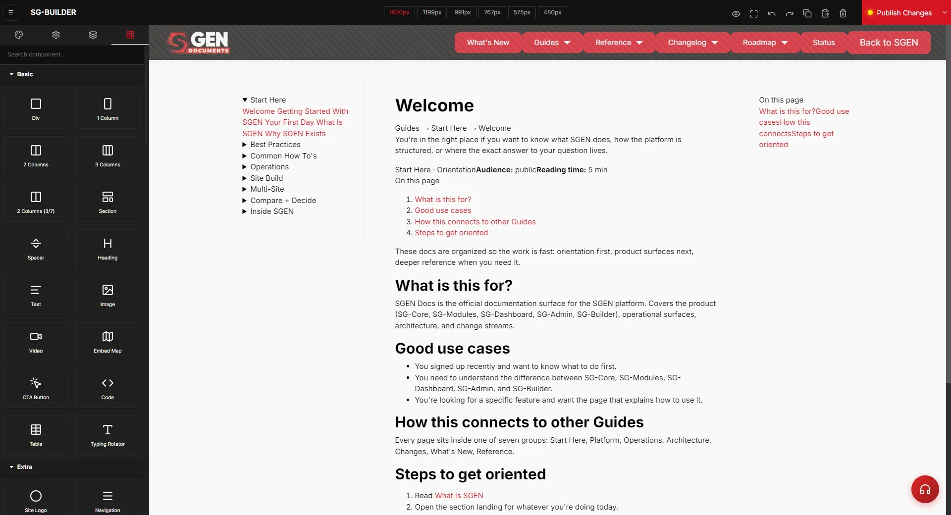
The device switcher controls which breakpoint you are editing. The six widths are: SG Desktop (1920 px), SG Laptop (1199 px), SG Notebook (991 px), SG Tablet (767 px), SG Mobile LG (575 px), and SG Mobile SM (480 px). Styles cascade from wider to narrower — set your desktop layout once, then override only what needs to change at tablet or phone.
Use this when:
- A multi-column section needs to stack vertically on phone.
- A hero heading at 56 px overflows at 480 px and needs a smaller size at mobile.
- Desktop padding (e.g. 120 px) is too generous on a phone.
- An image needs a height cap at mobile.
Good use cases
Two-column section that stacks on mobile. Click the left Cell, switch to SG Tablet, set Width to 100%. Repeat for the right Cell. Columns stack at tablet and below without touching the desktop version.
Hero heading that scales down on mobile. Switch to SG Mobile SM, click the heading, set Font Size to 32 px. Desktop keeps 56 px; narrow mobile reads cleanly.
Section padding that compresses on phone. Switch to SG Mobile SM, click the Section, reduce Padding to 48 px top and bottom. Desktop keeps 120 px. No CSS file touched.
What NOT to use this for
- Hiding content from mobile visitors entirely — use the Responsive Visibility setting (eye icon in the component toolbar), not the Style Manager.
- Testing how your page looks on a real phone — the canvas is a pixel-width approximation. Verify on a real device or use Chrome device emulator.
- Undoing a desktop style set by mistake — find the component at the correct breakpoint and reset the specific property. Setting a value to blank when you meant "inherit" produces unexpected overrides.
- Replacing a mobile menu — at small screens a horizontal nav bar will not fit. Use Appearance > Mobile Menu for a hamburger-style nav; adjusting Navigation font size at SG Mobile SM is not a substitute.
How this connects to other features
- Structure and layout in SG-Builder — column widths, stacking order, and row gaps on Rows and Cells are the most common per-device overrides.
- Appearance > Mobile Menu — at small screens, pair the Navigation component in your header with a mobile menu. Adjusting font size at SG Mobile SM is not a substitute.
- Text, headings, and buttons in SG-Builder — font sizes, button padding, and text alignment are frequently adjusted per device.
- Custom CSS — for responsive rules that span many pages, write a scoped rule in Custom CSS rather than adjusting every section manually.
Before you start
- Confirm the 5-level hierarchy (Section > Container > Row > Cell > component). Per-device overrides on Cells are the primary way columns reflow — a broken hierarchy makes responsive edits unpredictable.
- Know your target column widths. The most common pattern: 50/50 at desktop, 100/100 at tablet (stacked), carries through to mobile automatically.
- Decide which breakpoints need testing. For most layouts, SG Desktop + SG Tablet + SG Mobile SM is sufficient.
- Publish a test version before client review. Open the live URL in Chrome device emulator and a real phone browser before signing off.
Where to find it
Open any page in SG-Builder: Pages > [page name] > Edit in Builder (also accessible from Blog, Events, or any content type). The device switcher sits in the top toolbar — six buttons labeled Desktop through Mobile SM. The Style Manager on the right always reflects values for the currently active device.
Steps
1. Open the page in SG-Builder
Navigate to Pages (or Blog, Events, or any content type) in your SGEN admin. Click the page you want to edit, then click Edit in Builder. The canvas opens with desktop view active by default.
2. Identify the element that needs a per-device style change
Click the section, row, cell, or component you want to adjust. Confirm the selection in the breadcrumb bar at the top of the canvas. The Style Manager on the right shows the desktop styles for that element.
3. Click the device button for the breakpoint you want to edit
In the top toolbar, click the breakpoint button for the device you are targeting:
- SG Tablet (767 px) for column stacking.
- SG Mobile SM (480 px) for font size and padding adjustments.
- SG Notebook (991 px) for intermediate laptop-sized adjustments.
The canvas shrinks to that width. The selected element stays selected. The Style Manager shows values already set for this device, or inherited desktop values if nothing has been set yet.
4. Set the style value for this device
In the Style Manager, change the value you want to override:
- Column stacking: select the Cell, find Width or Flex Basis, set to 100%.
- Font size: select the text component, find Font Size, type the smaller value.
- Padding: select the Section, find Padding, enter the reduced values.
The value applies only at this breakpoint and narrower — it does not affect the desktop or any wider breakpoint.
5. Repeat for other breakpoints that need separate values
Switch to the next breakpoint and repeat. Most layouts need overrides at two points: tablet (column stacking) and mobile SM (font size and padding). If desktop and tablet are identical, skip SG Tablet — the cascade handles values you do not override.
6. Switch back to desktop and verify the override did not affect it
Click SG Desktop in the toolbar and confirm the desktop values are unchanged. A common mistake is accidentally editing at the wrong device — switching back immediately confirms the edit landed at the right breakpoint.
7. Publish and verify on the live page
Click Publish (the red button in the top bar). Open the live URL in a new tab, narrow the browser window or use Chrome developer tools (F12 > toggle device toolbar), and confirm the columns stack, font sizes reduce, and padding compresses as expected. Hard-reload with Ctrl+Shift+R if the browser is caching an older version.
What success looks like
After publishing, narrow your browser from desktop width down to 480 px. You should see:
- At 767 px and below, multi-column sections reflow to a single column.
- At 480 px, hero headings are legible at the reduced size — no text overflowing the screen edge.
- Section padding compresses — content does not feel excessively spaced on a small screen.
- The desktop view is unchanged — narrowing the browser does not alter the full-width layout.
What to do if it does not work
- Columns not stacking on mobile. Select the Cell, switch to SG Tablet, and confirm Flex Basis shows 100%. If it shows the desktop value, the override was not saved — set Flex Basis to 100% and Max Width to 100% as well; both must match.
- A mobile style is also changing the desktop view. Switch to SG Desktop and check the value. If it changed, reset it. The cascade runs downward only — setting a value at SG Tablet does not affect SG Desktop; setting it at SG Desktop affects all narrower breakpoints unless overridden.
- The Style Manager is not showing different values per device. Click the device button first, then click the element on the canvas. The Style Manager updates to reflect the active device.
- Published page still looks the same on mobile. Browser caching is the most common cause. Hard-reload (Ctrl+Shift+R) or open an incognito tab. If the issue persists, confirm the Publish step completed — the red Publish button should have flashed a save confirmation.
- The canvas preview does not match a real phone. The canvas is a width-constrained approximation. Always verify on a real device or in Chrome developer tools device emulator (F12 > device toggle).
- Font size override not applying at mobile. Confirm you selected the correct component. Text size set at a Cell or Row level does not cascade into nested leaf components — select the text component itself.
Related reading
- Structure and layout in SG-Builder — the Row and Cell hierarchy that per-device overrides live on.
- Text, headings, and buttons in SG-Builder — font size and button padding adjustments at mobile breakpoints.
- Card grids and pricing tables in SG-Builder — composite components like card grids frequently need column-stacking overrides at tablet.
SG-Builder device breakpoints
| Device button | Canvas width | Typical use |
|---|---|---|
| SG Desktop | 1920 px | Base layout (set once) |
| SG Laptop | 1199 px | Intermediate laptop adjustments |
| SG Notebook | 991 px | Intermediate notebook adjustments |
| SG Tablet | 767 px | Column stacking |
| SG Mobile LG | 575 px | Larger-phone tweaks |
| SG Mobile SM | 480 px | Font size + padding adjustments |