
Build a navigation menu
⏱ 60-second answer below · full page ≈ 8 min · skim the bold lead-ins to move faster.
In short. The Menu panel is a three-column builder: pick pages or custom links on the left, arrange them into a tree in the middle, tick which location(s) render it on the right, then click Save Menu. One save pushes the new tree to the header, footer, and mobile drawer — no rebuild step. You can have multiple named menus and assign each to a different location, or share one menu across Header + Mobile Menu. That's all of it — read on for the step-by-step.
On this page: What menus are · Fields · Before you start · Steps 1–6 · Troubleshooting · Next steps
How to build and assign site menus (header, footer, mobile drawer)
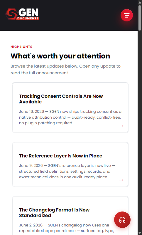
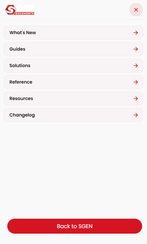
The Menu panel is the navigation builder. Create a menu, pick the pages or custom links it contains, arrange them (including sub-menus), and tick which locations render the menu — Header, Footer, Mobile Menu, or any combination.
A typical site keeps three menus active at once — Primary in the header and mobile drawer, Footer Links in the footer column, and a Holiday Promo menu drafted for December launches. The Menus list reads:
What is this for?
Menus are the navigation layer of your site. Every link in the header bar, footer column, or mobile drawer comes from a menu you built here. A menu is one tree of links + which location(s) show it. You can have multiple menus (primary, footer-only, utility) active at the same time.
Scope
The Menu panel covers: creating and naming menus, adding items (pages or custom links), nesting items as dropdowns, and assigning location slots (Header / Footer / Mobile Menu). This doc does not cover visual styling of the menu bar (that's Themes + Styles & Layouts) or the mobile drawer's chrome settings (that's the Mobile Menu panel).
Examples
Example 1: Build a primary nav. Your site has Shop / Subscribe / About / Contact as its primary pages. Create a menu called "Primary", drag those four in order, tick Header + Mobile Menu, Save.
Menu form populated:
On save:
Preview: Menu builder 3-column layout — a screenshot of this screen will be added here.
Example 2: Add a child sub-menu under "Services". On the same menu, drag "Consulting" and "Training" under the Services item. The header shows a dropdown on hover; the mobile drawer indents them. The result on your public site:
Example 3: Keep a separate footer menu. Create a "Footer Links" menu with Privacy, Terms, Cookies, Contact. Assign only the Footer location. The footer column renders them; the header is unaffected.
Example 4: Swap menus seasonally without losing anything. Your site runs a year-round nav and a December-only "Holiday" menu with gift bundles and shipping cut-offs at the front. Keep both menus saved at all times. In November, untick Header + Mobile Menu on the year-round menu, then tick those same locations on the Holiday menu. In January, swap back. No item is ever deleted — only the location assignment changes. The whole swap takes under a minute.
Example 5: Park a menu draft without showing it. While staging a full navigation redesign, create the new menu with no locations ticked. It sits in the Menus list and is invisible to visitors. When it is ready, tick the locations and save — instant cutover, zero downtime, easy rollback.
Fields
| Field | Type | What it controls |
|---|---|---|
| Menu name | Text | The internal label shown in the Menus list and location pickers |
| Menu items | Ordered list | Each item has a label (what the visitor sees) and a URL |
| Nesting / depth | Drag-and-drop | Child items indent under a parent; depth ≥ 2 creates a dropdown on desktop |
| Location: Header | Toggle | Displays this menu in the site header |
| Location: Footer | Toggle | Displays this menu in the footer nav strip |
| Location: Mobile Menu | Toggle | Displays this menu in the mobile drawer |
Multiple menus can have the same location ticked. The most recently saved menu with a given location ticked wins for that location. Leave a location unticked to keep the previously assigned menu in that slot.
What NOT to use this for
- Do not use Menu to style the navigation. The visual treatment (font, colour, spacing) is owned by the header/footer/mobile-menu chrome and the active theme swatch.
- Do not share menu deletion links. Delete only from the Menus page. Sharing a deletion link with anyone who has an active admin session lets them wipe the menu.
- Do not bind a single menu to conflicting locations. If two menus claim "Header", whichever saved last usually wins — unpredictable.
How this connects to other features
- Pages — menu items reference pages from Site → Pages. Create or rename a page there, then pick it in Menu.
- Posts / Blog — the same picker surfaces posts; link directly or link the category index.
- Header / Footer / Mobile Menu — the location checkboxes here decide which chrome surfaces render this menu.
- Templates — the active chrome templates wrap the rendered menu. If a template does not have a nav slot, the menu does not show even when location is ticked.
Before you start
- The pages you want to link are already created under Site → Pages (or the Posts / categories you want to link exist).
- You know which locations you want the menu on (Header, Footer, Mobile Menu — any combination).
Where to go
- Open the left navigation.
- Click Appearance → Menu. The panel is a three-column layout: pickers on the left, tree in the middle, locations on the right.
Steps
1. Create a new menu (if needed)
Click New menu, give it a name, Save Menu. The empty tree appears in the middle column.
2. Pick items to add
Use the left column's tabs: Pages (every site page), Custom Link (any URL with your own label). Tick the items, click Add to Menu.
Once the items land in the middle column, the saved tree shape that gets persisted looks like this — useful when you want to verify the order before saving, or when you're cross-checking against a backup:
The item type field accepts page, post (a blog post), category (a blog category index), or custom (any URL plus a label you type). Mixing types in one menu is fine.
A few practical notes:
- Tick before clicking Add to Menu. The picker appends ticked items in the order you ticked them. Untick a row and re-tick it to move it to the end.
- Custom Link is for off-site URLs and anchors. Custom Link items don't update if the destination renames — they're a fixed string, not a reference.
- Drafts don't show. A page with status Draft won't appear in the Pages tab. Publish it first, then refresh the menu builder.
- Renaming a page updates the menu label automatically. Page-typed items pull their label from the page title at render time. For a different label, switch the item to type
customand type it by hand. - Tree edits are atomic per save. Save Menu writes the entire tree at once — no per-item save. To discard unsaved changes, close without saving and reload.
- Location remaps are independent of tree edits. Flip a location tick and Save Menu without changing any items — the save banner names only the location fields that changed.
3. Arrange the tree
Drag items to reorder. Drag items slightly right under another item to make them children (sub-menu under the parent).
4. Tick locations
The right column lists every active location. Tick Header, Footer, Mobile Menu — any combination.
Preview: Menu locations checkboxes — a screenshot of this screen will be added here.
Two things to know about location ticks:
- A location can only feed one menu at a time. If you tick Header here on the "Primary" menu but Header is already ticked on "Holiday Promo", the most recently saved one wins. There is no "merge two menus into one location" mode.
- A menu can feed multiple locations. Tick Header + Mobile Menu on the same menu and the same tree feeds both surfaces — visitors see the same items on the desktop bar and in the phone drawer. That's the most common pattern; only split into two menus if you want different items per surface.
The save flash banner that lands on success names exactly which fields wrote, so you can confirm the location remap stuck:
5. Save Menu
Click Save Menu. The header and mobile drawer pick up the new tree on the next page load — no rebuild step. The save flash confirms exactly which fields wrote, useful when teammates edit menus in parallel.
6. Verify on the public site
Open yourdomain.com in a new tab and confirm the new menu rendered. Three checkpoints:
- Desktop header — the items appear in the order you arranged them. Hover any item with children; the dropdown reveals the sub-menu indented underneath. Click an item; it routes to the URL the picker resolved.
- Mobile drawer — open the site at narrow width (resize the window or use a phone) and tap the hamburger. The same tree renders with children indented one level. Tapping a parent expands; tapping a child routes.
- Footer (only if you ticked Footer) — scroll to the footer column. The footer menu renders as a flat list; nested children flatten into the same column.
If any checkpoint shows the previous menu, hard-reload (Ctrl+Shift+R) once. CDN edge cache occasionally holds the old markup for up to a minute on free-tier hosts. After that, the new tree is sticky.
The public site renders the active Primary menu like this:
The complete flow
For a new site nav in one pass:
- Click New menu, name it "Primary", Save.
- Pick Home, About, Services, Contact from the Pages tab; Add to Menu.
- Drag "Consulting" under Services; "Training" under Services.
- Tick Header + Mobile Menu.
- Save Menu. The header and phone drawer pick it up on reload.
What success looks like
- The public site's header shows your items in order.
- The mobile drawer shows the same tree, indented for children.
- Reordering and saving updates the public site without a rebuild.
Before / after a menu rebuild during the 2026-04-20 QA run:
What to do if it does not work
- The header is empty. No menu has the Header location ticked. Go back to the Menu page and tick it.
- I accidentally put two menus on the same location. Whichever saved last usually wins. Untick one and Save.
- My new page is not in the picker. Confirm the page is published (not draft) in Site → Pages.
Next step
- Pick a theme (color swatches + 8 chrome slots)
- Configure the header (logo, nav, CTAs)
- Configure the footer (columns + widgets)
- Configure the mobile menu (drawer)
- Customize global styles (typography, colors, buttons, layout, accessibility)
- Manage widgets (paragraph, image, embed, code)
- Use shortcodes ( etc.)